Content
I was expecting less actually after launching it into the game. The description could be some more, as it's really short in content.
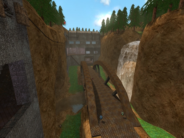
The screenshot is pretty clean, nothing to tell about that. Nice to see you've used the guibar to spin it up a little bit.
Theme
The them seems to be somewhat military forest-like. At the moment, it still could be improved a lot by adding more details which fit the theme to make it more clear as it's still pretty tough to say.
Texturing
The texturing isn't bad, but it often isn't a great idea to combine the gibbie textures with the techsoc and even put the lunaran and philipk also in the map. Why? Because the techsoc textures is a diffuse textureset with nothing else as the original texture (and some glow-mapped textures for the lights, woohoo). No specular light, neither any bumpmapping at all, which makes it look pretty odd compared to the highly bumpmapped gibbie textures.
There could also be some more contrast between the ceilings and the walls of bases, as it's just 1 of the same texture. Use some textureblending (if you don't want to blend anything on the floor) to make the ceiling a little more damaged and dingy.
Using the base texture of nieb as glass texture isn't very realistic, as it's not envmapped at all (not having reflections), which is quiet odd for glass. I would recommend you to use something like the glass texture in the trak5 directory and scale it up 10 times (to get rid of the ugly white haze).
Geometry
The geometry seems to be efficient. You haven't used a lot to get such quiet good result.
Lighting
The lighting is pretty boring. It's all just plain white. Try when lighting something not to take an equal or absolutely dominant number (like the colour-parameters 160 160 160 or 250 25 25) as primary light (the light-entity which has the biggest radius from the light-source). There is an exception on that of course, but as I noticed, it's not the time to bring that out now.
Detailing
As I already stated, there could be added way more details to make the theme really express itself. For example, using 1 of the same lights for all around the base makes it somewhat boring. Try to use some other lights also, like a search-light or even an emergency-light (or exit sign).
It's nice to hear some sounds though. There aren't many maps which use this advantage and people often forget to add.
Those stairs looks pretty unfinished, as they literately are some simple cubes putted on top of each other. Try to create the illusion that it's not like that.
Clipping/Noclipping
The clipping seems to be fine, but you can still notice that the wire at the opposite side of the waterfall was different before (because of the noclip).
Flow
The flow of the map isn't bad, but it's layout isn't that great. It seems to be a simplified nitro, yet some different dimensions to make it flow better. Make sure add a path where players won't attack only from front, which makes them doomed to kill the campers, not just avoid them. That really makes the map way more enjoyable to play. While running around, you still get stuck in a tube when you try to take the corner right before you enter the base and those stairs which lead to the upper floor are very close to that doorway, which makes it practically easy to miss them when coming out that doorway and catching the flag.
Furthermore, it only takes about 19 seconds (just by jumping and running) to get and score the flag, which is way too less for a ctf map. Of course some opponents would slow down this a little bit, but you shouldn't calculate that as it's not a stable variable.
Gameplay
The gameplay seems to be not bad. You still have to add a lot more pickups though, as the amount is way too less even for a map which seems to be like a 4 vs 4 at max. Remember, players should be packed with ammo (not too full of course!), while being hungry for health and armour. So adding the double amount of weapons probably would work out great.
Just a few more playerstarts wouldn't harm also (even there are already 7 each base, it's not bad to have like 12 each base), as they are divided in just regular and team-playerstarts anyway.
Overall
The map isn't as bad as I thought it would be. You can see there has been spend some effort on such a simple layout, but it still isn't deserving to be called done, neither great. Just keep up improving stuff and it could turn out in something really worthy to play on a lot of times.
