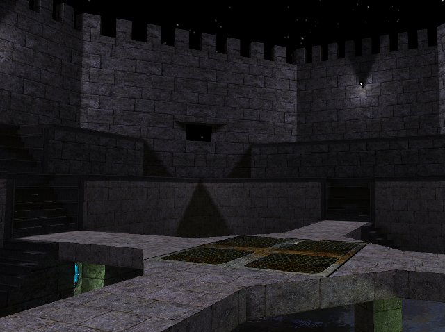
Thoughts as I played:
-Move the lamp model further into the wall, players run into it if they are running next to the wall.
-This map has some atrocious texturing. Steam coming out of orange light strips!? This map could really use some more detail on the outer walls (and about everywhere else too, but that's another matter. Actually the middle looks pretty good (comparatively) Maybe some more metal to fit with the grate in the floor.
-I do like how the grate mapmodel is worked into the center. It seems to fit there.
-Maybe you should only have teleports on two of the four side at the bottom, and not have jumppads everywhere either, just to add some uniqueness to different parts of the arena. I know that you didn't want the field to be uneven, but it dosen't have to be so perfect.
-There definitely need to be more weapon pickups. Yes, you designed it as an insta map, but if you're going to put in pickups at all, please put some effort into it.
This map is pretty darn bad, but still could be improved slightly without just redoing it. But yeah, I guess you have to try and see what works. The packaging was correct at least.
