Content
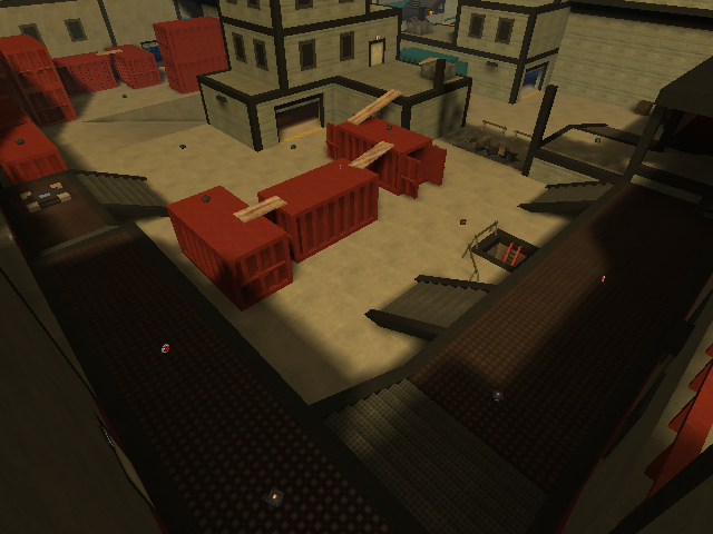
The screenshot looks pretty promising, yet shows of fairly what the map contains. The description isn't bad also.
Theme
The theme could be done better. It seems to be some storage facility, yet it's not containing much marks of it (only the containers, forklifts and cranes are revealing it). I'm sure you can come up with more than that.
Texturing
The texturing is pretty basic. The floors and walls aren't having any contrast (only a red and blue trim on the outside of the map sometimes changes that, but nothing else. Looks pretty boring).
So try to make sure there's more difference between a wall and a floor. That makes a map look way better.
There isn't any specific texturing-technique used, while the map definitely could use some textureblending on the floors (which would make the floor some more exciting also).
Geometry
The geometry of the map is incredible inefficient. Those fences in the middle of the map which aren't even that great looking are containing already 41k of triangles each! You can make the whole ctf map from twice that number actually (as 82k of wtr is just perfect actually).
So, lower the triangle-count by creating less heavy rendering geometry as those fences, but also those containers could be made way more efficient.
Why I actually recommend this? Because you can be sure half of the players won't be able to play this map because they will get less than 20fps, which makes the map unplayable.
Skytexturing surfaces which players aren't being able to see from the playground is also a good way to reduce the wtr, while also saving up a lot of lightmaps (which saves up in file-size again). If you receive some nasty lighting bugs because of it, use skytexture 0 and skytexturelight 0 to fix that.
Also don't forget, textures are actually the most powerful for showing off your intentions (between geometry, detailing and lighting). You can make a square cube look round just because of it's texturing. Lighting can also be very powerful compared to the other points, but it has more side-effects and is harder to perform.
Lighting
The lighting isn't bad, but the lights inside buildings look a bit odd. What about taking some less red/orange colour and some more to white instead?
Detailing
The detailing is as I already stated, pretty poor. It could contain so much more than just that. Think about barrel which felt and is leaking oil or any other liquid, a technical section, etc. I once imported several models which would fit pretty good to such themed map. You can find them over here.
You've added some broken details, like the teared floor, but be sure to add more than just that. Concentrating such thing only on 1 specific point makes it still look pretty odd, as the rest still seems to be some perfect world.
Clipping/Noclipping
The noclipping/clipping seems to be excellent, nothing to say about that ^^.
Flow
The layout of the map isn't that great. You easily bump against several garage doors, so what about putting them some higher so you wouldn't bump into them while jumping?
Putting ladders next to walls while they are noclipped feels pretty odd, as it creates the illusion you can climb on them and then have access to a higher platform (while this actually can't). Try to think logical when doing such thing.
The containers are standing too close to actually run between them (as you are canned between them) or too wide (you're being forced to jump because else you'll fall into the gab and get "stuck" while being forced to take another path or reattempt the same journey yet again).
Gameplay
The gameplay is pretty flat and stretched, which makes it somewhat boring. This probably is being caused because Sauerbraten has a way less realistic gameplay as TF2 (even it doesn't look like that). So I would advice to add some more layers of floors into the map than just 2 (which is at some places 2 and 1 separate, still not much) and make it less stretched or add more cover (as Dokodog stated partly).
Be sure to add at least 1 regular playerstart, as it's pretty annoying you're being spawned right above the map while being in coop-edit. Next to that, be sure to add at least twice the amount of playerstart you've got now, as 7 for each team is way too little. Keep in mind the map should be playable with something like 20 players (because of it's size).
Unlike the amount of health you've added, there isn't much to pick up at all for like 20 people. Keep in mind, a player should be packed with ammo, while being hungry for health and armour (not too packed of course!). So having like 10 more shells and grenades, 6 more riflerounds and bullets would do the job.
Overall
You seems to know the basics of creating a map pretty good, which is being showed off on the map. There still is enough to learn and enough to improve on this map though. 6/10 would be fair enough for now.
