Seems to be a pretty interesting map compared to others lately (on first sight).
Content
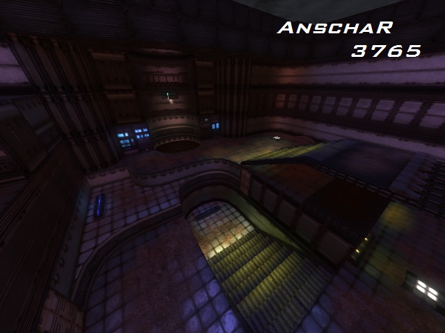
The description is a little small, yet it contains your purpose of posting and that it's still WIP. The screenshot could have some more dimensions than just the YA spawn-area and some computers next to that. It wouldn't be a bad screenshot for when Cube Engine 2 is still loading the map though.
Please use the .zip format only for packaging your content file, as other formats may cause unexpected problems.
Theme
The theme seems to be space-like. You've added already some details which shows off that it actually is about that (as certain texturing, certain details like those computers, the acid-green water, etc), yet it could have way more of such things. When thinking about space, you'll get things popped up in your mind like shuttles, satellites, futuristic military stuff, etc. Really try to do some brainstorming for such details as they can make the map look really good. A very good example which has just the same theme is the map dock. You could use some of the ideas in that map, but create your own from it.
Chasester has a good point about the water, it's still too clear to feel actually different as usual water (and even looks more odd also).
Texturing
The texturing is somewhat odd. Using plate-textures as pk_01_vent_wall01a isn't a very good choice for big trims. They often only should be used to keep some difference between the main wall-texture. A very good example of this is the map serenity. Just observe it and see the differences between that map and yours.
As P1noko stated, it wouldn't be bad just to use a texture for those computers (as they aren't that great shaped, neither textured). You could use the custom texture pack of philipk, which is right here. It would also make the map way more original by using several textures out of that pack.
Geometry
The geometry isn't quiet great yet also. You've added some pretty nice curves and shapes, but also added pretty square other things which conflict those curves and shapes. Take fore example the walls, which are solid and flat-shaped, while the staircases are light and minimized in space they take.
Lighting
Can't tell much about this because as you said so, it's not finished. I still do can give you this advice in lighting techniques.
As it's a daylight themed maps, some simple sunlight often is already enough to do the trick, so don't try too hard.
When there are still places which look boring because it's not lighted, then it's recommended to use several lighting techniques, as like putting 1 light-entity which has a small radius but is very bright, close to the light-source and putting 1 or several light-entities which have a lot bigger radius but are having a low value on the RGB-parameters, some further away from the light-source.
An advanced technique on that is the use of the spotlight-entity, if you wish other surfaces shouldn't be lighted by any of the light-entities, but use spotlights with caution and especially with sense.
Detailing
Told already a lot about the detailing.
Clipping/Noclipping
The clipping/noclipping is pretty strange. Be sure to make some sense when closing off things like a cave and some huge open doors. It feels very unrealistic right now.
Flow
The flow isn't bad. I would advice to mark the jumppads some more, as they still are just some textures bars right now (and one hoof-shaped jumppad).
Also the teleports still look pretty cheap.
To think about certain areas wouldn't be a bad idea, as for example, what's the actual purpose of the jumppad which launches the player from the main floor to the 1st floor right into the YA? If you take the stairs which are right next to it, you're even faster for grabbing the YA than using the jumppad (and you risk to get killed more easily because of the vertical and only a little diagonal when running, push).
Gameplay
The pickup placement is a little odd. In such map, there shouldn't be 4 rockets and 5 bullets, while the rest only exists in amounts of 2 or 3.
Rockets should appear in a small amount on such maps (like 1 or 2 is often more than enough), riflerounds and bullets some more (like 2 or 3), grenades and shells should appear more common than all of those (like 3 or 4 times), because they only do some real damage in certain cases (while the other weapons are less affected by that).
As P1nokjo stated, it wouldn't be a bad idea to more one of the armours (or the teledest or teleport), as they create a pretty unbalanced gameplay right now. and also some more health would help (like 1 or 2).
Overall
The map seems to be not a bad start. Just keep working on it and I'm sure it could become something pretty.
