Content
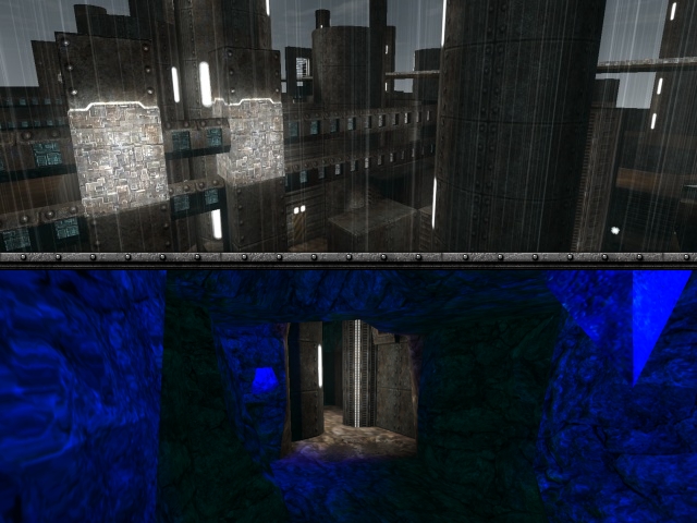
The screenshot looks pretty dull. It shows off the map pretty good, but isn't displaying it great though.
The file which supposed to execute things as textures is generally called package.cfg, so rename textures.cfg into that.
You've added plenty of information about the map, which is pretty good though.
If you add a read-me file, please start the name with the name of the map, so people don't have to look for it that hard. So for example mine_read_me.txt. It also is allowed to put it just into the cfg with some // before it.
Theme
The theme seems to be pretty original. It's a pretty long time since the textures actually are being used for such purpose, but they don't fit the urbanic part very well. If you want to keep the urban in it, be sure to take some other textures instead.
Texturing
The texturing is a little odd. There are often cases which it technically could be done better (as geometry isn't being separated, while it actually would look way better if it would. Like on stairs for example).
Also, the water2 texture isn't convincing me that it are crystals, especially not when they are being scrolled with such amount of speed over it's geometry. Try to take some other texture, like a coloured caustics00 and maybe even use the pulseglowworld shader for some better effect.
Some rooms could use some more textures also, as they contain only a few, like the panel64_0 texture.
There are still a lot of texture errors in the map. Be sure to fix them all.
Geometry
The geometry is pretty odd also. You did a nice job to keep it simple, but it often looks too square and too straight. Take for example the cave, which could use some more shapes instead of straight ceilings.
My advice would be, flip your set up. Try to add a lot of shapes and stuff into the ceiling and walls, while minimizing the shapes and contrasts in geometry on the floor. This keeps the flow being unharmed. Take the map shipwreck for example.
Lighting
As p1nokjo already stated before, the lighting is really odd. Try to create some realistic atmosphere by adding some more convincing light-sources at the light which is being emitted. Also, try to keep the lighting smooth. There should be contrast in an atmosphere, but it shouldn't be that heavy. Take a look at metl4 for example, which has a very similar theme as your map.
Detailing
The detailing is being lacked a little bit. The long stairs you've added aren't looking great at all (very contrastic shapes, which isn't fitting the theme very well, neither the textures attached on it). Next to the crystals, there aren't much details at all. Be sure to add some more so it really shows off the theme better. Think of what you would get confront with when you're running through a mine.
Clipping/Noclipping
As p1nokjo already stated before, the clipping is a mess. When you want people not to cross over crystal, keep some realism in it and make them higher so people won't be able to jump over them at all (neither trickjumping).
There are a lot of such cases which it feels very weird why you can't continue your journey in the way you want. Be sure to add some proper explanation instead of just some clipped air.
Flow
The flow isn't great at all either. It doesn't look like you've started with some layout which has a proper plan. Take for example the entrances to each flag, as there is in both cases just 1. That would kill the idea of playing capture the flag, because players only have to defend 1 entrance. Be sure to make at least 2 path to each flag, so there is at least a little bit of a surprise when your opponent grabs the flag and runs to their own base as fast as they can.
As Sauerbraten isn't having a measured out flow on it's geometry and textures, don't try to do so. Create higher ceilings on doors, caves and doorways, as you bump your head almost every time you jump.
Also, don't add bottlenecks and dead ends into maps, especially when you still don't know their results. When you navigate through a map you still don't know very well while you have the flag and you run into a dead end, that feels pretty annoying. Avoid such things by making sure there is always a go-through wherever you are.
Gameplay
The gameplay is pretty odd also. There aren't a lot of playerstarts for the size of the map and also a very low amount of pickups. Be sure to add more of them.
Overall
In overall, the map seems to be not bad for a first or second attempt, but it's still very random and not well thought. If you would continue improving this map, I would advice you to consider well-timed pathways from flag to flag (and base to base) and create details and stuff after that.
I'll rate 4/10 for now.
P.S. I know you failed to update it (as you stated into your content). I'm pretty sure I know the reason, because the map is almost 8Mb in file-size. Try to lower this by setting lightprecision to 64 (which reduces your old version to almost 3,1Mb instead). Also skytexturing surfaces which players aren't able to see helps reducing the lightmaps, which saves up a lot of file-size again (and also makes the map more playable for people which having a slower pc or laptop).
