Content
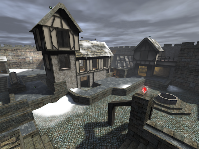
The screenshot looks fair, yet lovely. It shows off the map very well.
Theme
The theme is being displayed pretty good also. I'm still missing some pools of ice to make it look even colder. Just think about such things to make the theme appear even better.
Texturing
The texturing is in overall somewhat fitting, but there are often cases which it doesn't at all. Take for example the trim on the doorway which a teleport is floating in, the ik_brick_trimh32a texture could better be replaced for a smoother kind, like the 4_conc_floor01 texture. There are way more of such examples so be sure to check that out.
Geometry
The geometry seems to be efficient, yet detailed enough.
As the map still consists a lot of wtr which can be reduced, I would advice to skytexture surfaces which players aren't able to see from positions where they usually play.
This also saves up file-size because of the lesser amount of lightmaps which are being produced.
Lighting
The lighting looks pretty smooth. It seems to fit the theme very well.
Detailing
Some rooms are pretty empty and aren't containing the usual trimmings and stuff as other rooms have, which makes it look unfinished.
Clipping/Noclipping
The clipping isn't bad, but there are still a lot of errors in it (in and outside the map).
Be sure to catch them all.
Flow
The flow seems to be ok, but still not that great. There still are several doorways which makes your head getting stuck for a moment when jumping. So be sure to run around some more times and modify such things.
Gameplay
The pickup placement could be better. Try not to concentrate weapons in rooms, but spread them out some more. It's more tactical to let players move from 1 side in the room to another to get 2 pickups, than just putting them in the centre; because then players just grab the goodies and run out of the room as fast as they can again. So there wouldn't be much risk in getting pickups when concentrating them.
Overall
The map seems to be half-way and not that bad. Keep it up, I'll rate 6/10 for now.
