Hehe wasn't expecting this map on quadro ^^!
Content
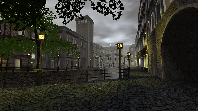
The screenshot seems to be ok. It's not revealing a lot, though it shows off the theme and such on a subtle way.
Excellent packaging...
You can even play it on Singleplayer? Haven't seen a single monster while doing so. Neither was able to find the carrot.
Theme
As several others have already stated, it looks very similar to venice. But unlike that map, there have been added several things which fits Sauerbraten like it currently is.
Texturing
The texturing is sometimes a little odd. As for example, the mm-brick71a isn't feeling right on a wall, as it is more meant to be used outside a building. There are some more of such examples, but that probably is one of the most clear in that category.
Geometry
The map counts A LOT of wtr. 310k of world triangles is a lot, even for a justice map (it reduced to 247k of wtr on SVN). Try to consider which thing are really noticeable and can't be done without using geometry. Take from example the trimmings on the windows, which could also be a texture for a part.
Also the inside of the windows which carries the concrete-tan texture of the nieb folder, could use way less wtr by putting the surface equal to the normal wall.
Lighting
There are a lot of light-entities inside the houses, but actually never any light-source. This looks pretty unnatural.
Detailing
There have been added some details. I understand adding even smaller details would be a waste as the map already is very heavy to render, so I won't comment about that.
Clipping/Noclipping
The clipping seems to be fine.
Flow
As I'll compare the map to venice, it has some better flow as that map. The only thing which could be done better is the size of the doorways, as they often are very tight (they could also be higher, but that's not the biggest problem).
Nice to see you can't bump your head against the ceiling when standing in a room.
Gameplay
There have been added plenty of playerstarts (40, very nice ^^!), but not enough ammo for a proper amount of players (like 24). Be sure to add way more, because even for a 2 on 2, the amount already is pretty low.
Overall
The map seems to be an improvement of venice. As I'm not a fan of such gameplay and flow (while some new generation often is more), I won't comment about that a lot. I'll rate 6/10 for now.
