Content
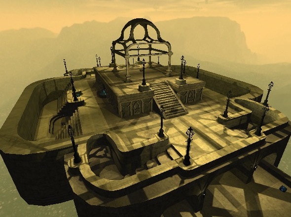
Seems to be an pretty artistic map, interesting screenshot (a bit pixelated, but it does the job).
The packaging is incorrect, be sure to avoid getting folders like "_MACOSX" inside the zip-file; there is no need for them. Even you mentioned it in the read-me, do people a favour and package the map in the folders Sauerbraten/packages/base/
Try to use upper-case symbols in names of maps as less as possible also, because some operation systems are sensitive for that (while others don't give a damn).
Theme
The map isn't really having a theme. Only the name reveals what it actually is. That's not a bad thing, but not a strong point also. Be sure to add more theme-related details to the map.
Texturing
The texturing is pretty much the same. Only the torches are creating some contrast to the rest of the textured surfaces. I'm pretty sure you can make it look way more colourful, or just enhanced (like texture-blended paths, some grass, etc)
Geometry
The geometry is pretty good. Curves haven't been over-detailed and still look right to be called "curved". Other shapes looks fine as well. To me, this is one of the strong points of the map.
1 disadvantage is that the map is symmetrical, which is (almost) never doing well for deathmatch maps (confusing, boring, etc). So try to make each side look less similar to each other. A pretty easy way to do so is replacing stairs for a jumppad (and visa versa), or changing the pathway entirely.
Lighting
The lighting looks rather odd (as others stated above). Yes I've downloaded the latest version of the map, but it still doesn't feel right. There are a lot of light-sources (like torches and lamps), but they seem not to emit the light actually (by having no real visional source). I know it's very tempting to put the light-entities inside a torch to let shadows of the torch get painted onto other surfaces, but it often occurs in odd looking patterns (especially when that technique has been done on light-sources which are standing very close to each other). So I would recommend to take the light-entity out of the torch and put it just as close to the front, so the wall where it is attached to still has some shadow, but the rest has not.
Detailing
Only the torches, lanterns, fountain and patterns on the tombstone can be called details, which isn't a lot. So as I already stated, add more theme-related details. The already added details are looking impressive though.
Clipping/Noclipping
There actually isn't any clipping/noclipping yet. Be sure to noclip the torches (as in the lower floor), as it's pretty annoying to bump against them while jumping.
Flow
The flow isn't really bad, but not great also. When you try to get from the upper-floor to the lower-floor via those stairways, you bump against the ceiling. The rest of the map is feeling just a little odd. There often is just too less space to strafe or just to far away to reach the next platform while jumping.
Gameplay
There are way too less pickups and playerstarts.
I'm pretty sure you could add at least 4 more to have some less predictable play (as on the lower floor there are none).
I understand not to add rockets on the map, but grenades shouldn't be that big deal actually as they are way harder to use. Because of the curves even makes them a pretty tactical weapon to use, instead of on open areas which usually is happening. That's why I would recommend to replace the shells on top of the map for grenades, so it could count a bit like a quaddamage but yet less powerful. Adding bullets around the map wouldn't be that big deal either, as the map has enough cover.
Maybe also add some (more) health and armour? Ok, it's not a great idea to add armour, but the map shouldn't be played like it's some kind of multi-instagib. Players should be able to recover them and they definitely can't with just 1 health.
Overall
The map isn't looking bad, but still can be improved. Keep it up and I think it could turn out in a pretty looking map which is also slightly playable. 6/10 for now.
