Long time ago since I saw a map with exactly that name.
Content
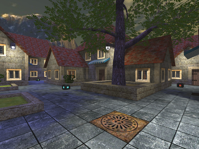
The screenshot seems to be telling a lot about the map already, which isn't a bad thing. There still could be some more explanation about why there is such gameplay and flow, why such textures, etc.
Theme
The theme seems to be urbanic, which is quiet original compared to all other themes. It still all looks pretty repetitive, which isn't expressing the theme that good.
Texturing
The texturing isn't that great at all. A lot of different textures has been used together, while they aren't fitting each other that good. For example, there are way better roof-textures as the ik_brick_3216d texture. You could even use some of the custom roof-textures, like those beneath this line of text:
Roof texture pack
Gor & Mitaman roof texture enhancement
FBP's roof-enhancements
There could also be used some more techniques, like texture-blending, autograss, shaders, etc.
Geometry
The geometry looks very simplistic. That's not bad, but you can definitely see that wasn't the intention. Despite that, the wtr is still an immense ammount of 158k. Be sure to slice that, like retexturing the roofs with a bigger gridsize on places when possible (it sometimes happens Cube Engine isn't remipping as it should, like in this case).
Lighting
The lighting is a bit odd. The skylight isn't fitting the skybox at all, while the light2a texture of trak5 is emitting yellow coloured light, even it the texture is just white.
Detailing
The detailing seems to be lacking. It all looks the same, while nothing is broken (or dirty) at all. Keep in mind, when taking a realistic theme, don't try to create a perfect world, as that's not realistic. Make some broken walls and tiles, floors which aren't even, etc.
The details you've created inside some of the houses aren't bad, but they aren't very easy to spot compared to the outside of the houses.
Clipping/Noclipping
The clipping/noclipping seems to be good, nice work.
Flow
The map isn't really flowing at all. You often bump against the roofs which stick out on the pathways, while the main floor is very flat (which makes it pretty boring to run around). As there has been stated before, what about adding some more height-difference in it?
Be sure players should also be able to strafe freely (just as being able to jump freely), as most people don't like to be in a very strict and tight area (of course, it's also shouldn't be the meaning of having too much space, so keep it subtle).
Gameplay
The gameplay is pretty odd. Providing players riflerounds in towers isn't a very good idea, as you'll get people won't move at all and stay in those towers, while they actually should be running around getting more pickups and frags. It's not a problem to let them spawn there, just those riflerounds spawning right there isn't smart and of course, in instantgib this still would kill the whole gameplay. So I recommend not to let people spawn in those towers.
Keep in mind, when you provide weapons in an area before the place where they actually are useful, you can create a deeper layer of play (if you guide them to that place also, which can be done by other pickups, flow or other players).
Overall
The map seems to be not that bad, but it's not feeling right. I would suggest you take a look at the map suburb, as you can definitely notice some height-changes there.
Replies are open for now...
