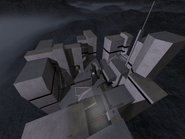
Finally took some time to look around on the map, so let's go.
Content
Fine screenshot, fine packaging. Nothing more to say about that.
Theme
The theme, gosh I start to hate it. Always the same boring trak5 base and nieb concrete textures which are being used for it. I doubt there aren't any better textures for that.
Texturing
As I already stated on the theme, would it be bad to be original instead of taking just the same textures as like 10 other people already do?
The black trim looks pretty odd and almost screams like it should have some more colour in it (or even be a light-source). Probably while using the pulse(glow)-shader, that would look way better also.
Geometry
The geometry is pretty good. The shapes are made even, yet efficient.
Lighting
The lighting looks odd. There are a lot of lights in the stairs, while they aren't emitting any light at all.
Detailing
As you probably have kept the map simple, I understand there aren't a lot of details added. There are several vents and such, which are screaming to have some particles near them. So what about adding that?
Clipping/Noclipping
The clipping/noclipping seems to be fine.
Flow
The flow seems to be nice also.
Gameplay
Same counts for the gameplay. I like the idea of those coloured trims to be a mark of what spawns nearby for "heavy" pickups.
I agree this time with Fatum that there are too much pickups on the map. In this case, players rather could play efficiency instead of ffa.
Overall
The map isn't looking that bad, but it feels like the map isn't really kept "simple" by a reason, rather as not being finished.
