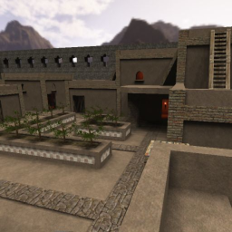
Well, I agree Greaserpirate for a first post it's a pretty good map.
Content
The screenshot seems to be ok, even it could show a little bit more than just piece of the map.
Theme
The theme isn't really coming through. Your saying it's an arabic-styled map, while I don't see much of that back into the map. Be sure to mark that even more into the map. Look at maps like "arabic" or "dust2" and see what makes them different from your map.
Texturing
I also agree with Greaserpirate, the "matbrown_lgt2" texture of Soc isn't a really good choice to use as a primary texture. It's a texture which shouldn't be used at all times, just only on a few places and only in some cases. It also isn't really paying off for the theme.
Geometry
The geometry still needs some work too. Putting a repetitive wall all around the map makes the map look very boxy and unrealistic. Be sure to add something like hills and a gate to make it more natural.
Lighting
The lighting isn't really bad, but it's still not that great on some places. Like there are corners in buildings which are definitely reachable for the torches next to them, while they are unlighted.
The skylight makes the map look very neutral and pretty boring actually. Be sure to add something else instead, as skylight is actually meant to neutralize a very bright light which is often putted outside the map.
Detailing
There isn't much detailing yet. Only some mapmodels (actually provide real detail. This wouldn't be bad if they wouldn't be overused. Be sure to use several mapmodels instead of just a few types, as they lose their "magic" of being a detail when they appear often.
Clipping/Noclipping
The clipping still needs some work. Players are able to get outside the map and even gain access through walls after that. Be sure to add a ceiling of clip material, to prevent this.
Flow
The flow isn't really bad but still needs some work. There are still some doorways were players would bump against the ceilings when they jump (especially on stairways in this case).
Gameplay
The map is still lacking pickups. Be sure to add them, as the map should provide more than just modes like instant gib.
Ever heard of the option "entselsnap"? It's binded on "6" in edit-mode. Be sure to use it next time when placing things like playerstarts.
Overall
The map looks ok for a first-post, but still requires a lot of work to get a really nice looking map. Keep it up! I'll give 4/10 for now.
