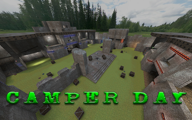
Seems like someone has been resurrected?
Texturing
I assume you kept the texturing the same as the original map (do you actually have permission to use the original map as a template?).
I recommend to use more textures (and blending), as it's original has been released in ctf-edition and the mode ctf was brand new for Sauerbraten, while there also weren't such high standards to maps as there is today.
Geometry
The geometry is just as it's original; ugly. It's all blocky and having nasty contrasts. Be sure to add some smooth geometry if you want to have a curve, instead of just 1 slanted cube.
Detailing
No details has been added to the map at all; except the details which already were in the original. You even disguised details, like the trim around the doorway next to the flags.
Why did you actually deleted all trees? They fit perfectly to the skybox.
Lighting
The lighting looks incredibly boring. Light seems to be come from everywhere and there isn't any contrast outside the bases.
Clipping/Noclipping
You failed miserably doing so. Why? As people have access to the top of the ceiling of clip; by doing a double grenade-jump or just using the quad with a single grenade or rocket. Be sure to check your work before releasing it.
Flow
The flow is just like its predicator, barely one. The floor which carries a "grass2a" texture is just flat (while it wasn't that much flat in it's original). You haven't even fixed the ceiling above the flag were you bump your head to if you enter the room which the flag spawns in.
Gameplay
Well, this is probably the only thing which really is improved as the map seems to be less "campy" as it's original.
It is very noticeable though, that you haven't even putted effort in setting the direction of the playerstarts which you've putted really to 0 or 180, what a shame.
This remake seems to be a complete disaster. Be sure to start from scratch next time and put some real effort in it. This is only 2/10 worth to me.
