First of all, nice idea! I was actually planning to do the same once :P.
Theming
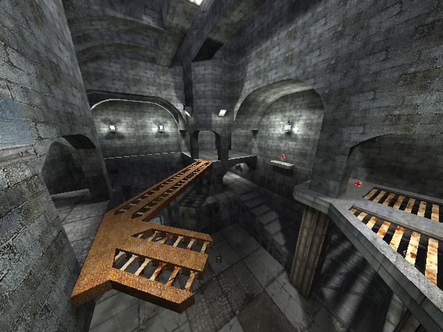
- There isn't appearing one. The map seems to consist out of a lot of bricks walls, but It doesn't have a theme yet. Be sure to take a theme. The original has a castle-ish theme, but I wouldn't recomment to go for that because it's very unoriginal.
Texturing
- Could be better to me. It's very plain textured. There aren't any areas where you would think "here has been putted a lot of effort in texturing this place". Be sure to add more contrast in the textures, but don't let them split! Make the contrast go smooth from area to area.
- Another advice is to add dirt on the lower floors (just like the original map in Quake Live) and use textureblending for a more realistic
feeling.
Geometry
- It's very basic and straight. When you play it's original, you see all curves are way smoother and aren't in contrast with each other. Also, you never noticed the stairways in Quake Live and even in Quake 3 Arena are way smoother and round that your showing here? It's part of the eye candy in the map, use it.
- When you take textures which show of that the place is "ruined", put a mark on that and use the geometry to really show areas are ruined. This makes the map looks way more realistic.
Lighting
- The lighting is also plain (just too white and way too less contrast actually) and makes the atmosphere boring. Be sure to also add more contrast here, like the lights more blue or green, while the daylight is a bit more yellowish.
- There aren't many lighting bugs in the map, but probably just because of the geometry which is low quality.
Detailing
- If you try to use rain particles, be sure they aren't running trough walls or ceilings. This really kills the atmoshpere and is very unrealistic.
- There isn't any other detail at all, exept the bridge, which could be textured better.
- Also add trimmings on wall, edges, etc, to show that it's an end of a platform or area.
- Be sure to make the curves around the vents really round, instead of some weird oval shape. Another advice is to use the bigger rears which should be
somewhere in the "models" folder (can't find now, sorry).
Clipping/Noclipping
- The player can't get out of the map, but can get stuck in doorways or have access to the small roofs above the highest platforms. Be sure to fix this.
- If you copy-paste geometry which you noclipped in 1 intire selection, the selected cubes which have no geometry at all (but do have material such as noclip or clip) will dissapear. This creates a cleaner look in edit-mode and works easier when your working nearby.
Flow
- It isn't great. Be sure to create a (very) similar flow if you make a map from another game. Also make sure the space is fitting the flow, so you don't bump into walls, pillars etc.
I've also made some remakes of Quake maps (Arena of Death, Final Instinct) and even based a map on it (scedm5) and I know how hard it is to convert the strafe-jumping set up of Quake, into the flow of Sauerbraten. My advice is to take 1 jump in Sauerbraten (which has been accelerated before) equal to a strafe-jump of Quakelive (starting from standing still). This seemed to help me creating a fine flow for all those maps.
Gameplay
- The pickups aren't placed well and are placed in a way too low number. Be sure to add more shells in such closed map, for a better and less predictable gameplay. I would recommend to delete 1 of the bullets where originally would spawn a lighting gun. Put the bullets somewhere else instead.
- Technically the pickups aren't placed that bad (like the grenades close to the teleporter which leads players on the bridge), but there just aren't enough.
- Be sure to check out the tactical positions of the original map, because you missed some of them.
- I like the small "sewer-like" hole on 1 of the upper floors, where you can spam grenades to a lower floor or just the opposite way.
This map is far from finished and still needs a lot of improvements. I won't rate it yet.
