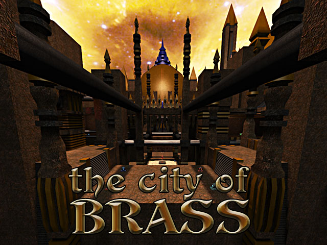
This medium/large size map is a work in progress CTF map. The gameplay is like a big tejen for CTF and Damnation for capture. InstaCTF is pretty hardcore here, it have some umbeivable long shots and there are some minor tricks.

It have 9 bases, quite temporally, and, of couse, it works better for a multyteam macht than for a standard 3vs3.
Placement of items and playerstarts is temporanly and there is, probably, too much healt in the center. Suggestion are appreciated.

Also lighting is far from complete. And i hope its clipped well enough. Is not my usual to make so heavvy maps, and i would like to optimize it, could someone advice me about how to do it?

At the least it should be 100% playable, if you have a nice computer, in each mode. Happy fragging!!!
I have forgot to thanks lots of people wich suggested me from the first layout to this post, and make it possible:
At6, for some details, and decors on the map.
Zooka, for some layouts inprovements.
All the ICC clan, for suggestion and testing the layout.
The one wich made the basic shape of the couple... you are great.
Meister for suggesting a good lighting (and others things...)
UPDATE -1:
Ok, i have failed at simplyfy the map, now is 200k :D
I haven't removed the particles, but add some to ensure also nice macine can exspect some lag XD - not seriusly i need an excluse for some clip/death. I haven't texured the map more, or removed the cubes for ammo. I don't know if this fixes can greatly improve performances, they will be consider in a future update. I haven't clip the pipes, i like how they are, you need a bit of train to maximize the speed and stability i like the fact that some tricks, can be hard to do. What i have done in randoms way is:
- The under spikes are half size the original
- Better clip in the upper base
- New skylight, and relatives ones...
- Some details finished
- Removed some healt from the centrer and added an MG and GR
- Removed the stairs near the jump - the jumps works enought
- Removed the teleport holes, i wasn't happy with them. I wasn't happy of the insta teleport too...
UPDATE -2:
Is SVN only (mainly for remip funcions), new textures
