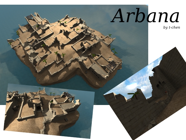
It´s great to see that you have found your style and I enjoyed your maps before, but this isn´t as great as I first thought.
Layout : The layout is pretty good and it finds a good balance between open and closed spots. There are a lot of ways and hardly any camper spots. You can´t camp from flag to flag and it´s funny to run around the map.
I like it how it is ! 10/10
Gameplay : The gameplay works great, too , but I got a little problem with ctf : If you want to get the flag you have to kill a little red-army because nearly every spawnpoint is set close to the flag.
Could be improved a bit ! 8/10
------------------------------------------------------------------------------------------------
Now I come to the designical issues, which can be skipped (because I think you know it isn´t that great)
Texturing : You only used five textures. It doesn´t look bad , but really boring. I would suggest to use some more contrast. 4/10
Detailing : The map isn´t detailed very well and it doesn´t need to , but some more would give the whole map a better feeling. Especially the terrain could be done much better and the background could be done better, too.
4/10
Lighting : One light, which gives a good effect, but it also looks boring :S
3/10
-------------------------------------------------------------------------------------------------
Well, the layout rules and the gameplay is lovely too, but when it comes to the designical part , the whole map goes down. It doesn´t look bad (don´t get me wrong) , but it´s really boring.
I definitely can´t wait to see this finished.
Only Layout and Gameplay : 9/10
Layout/Gameplay/Designical issues : 5,8/10
I won´t rate it yet, but I will play it once more :P
Greetings !
