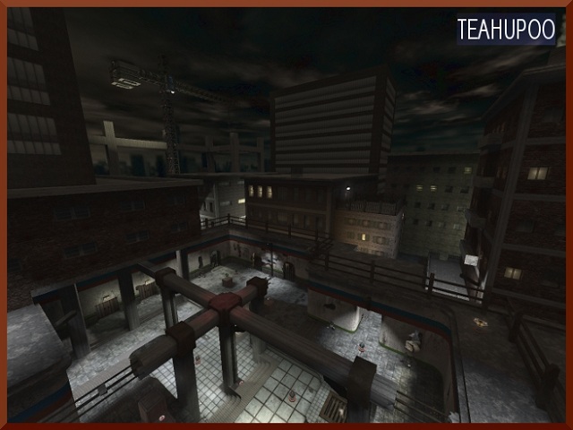
This map already has been released on another name?
I'm not sure wich name it was, but I'm very sure I've seen it before, long time ago.
Not bad theme. Haven't seen a lot maps from you wich were urban-themed.
The texturing is not bad, but could be better. As example, some lamps have the "mm-ceilinglite3" as texture, but it's not fitting at all.
Also, the glowmap of other lamp-textures (like your own costum one) is unnecessary, since the light-texture could be it's own glowmap.
Every pair of stairs have a plate-like texture on their steps. Somehow, this texture doesn't fit the geometry (and theming) at all. What about to add some more "lined" texture, wich really fits the geometry of the stairs?
I like the costum white-concrete texture, even tough it has a strange normal map in it (it doesn't make the texture look that great in game).
The geometry isn't bad, but in some cases, I'm pretty much wondering how could this 1 on 1 map be 87k of wtr? Ah well, it's not that big deal in this case...
The detailing is pretty good, but sometimes could be better. What about some trimming around edges?
The lighting is fine, too much white to me but it will stand like it is now either.
The clipping/noclipping is fine, nothing to comment about.
The flow is not bad, but could be better. You can definetly feel that you have tested it with experienced sauerbraten players, like as example the boxes (wich aren't that good flowing). When you jump from the health to the GA, you only have a very tight ammount of time to jump correctly, so you land on the box of the GA. Make sure noobies also profit of this and make it less hard to do so (like nocliping a small strip from the box of the GA).
The gameplay isn't bad, but could be better to me. If you control the highest floor, victory seems to be yours (especially because the YA, rockets and the HB spawns up there). Make sure the player on the ground has also an advantage, like swapping the GA on the box for a YA and swapping the YA on the roof for a GA.
Also, putting "health" looking marks under pickups isn't that great idea, since it's even easier to time where the ammo get spawned. It isn't logical for the theme either and isn't adding any detail at all.
What about adding another entry to the roof? the 1 and only teleporter to that is pretty vurnable for camping and isn't giving the gameplay a that good image.
I like that it's something different instead of the creations you normally deliver to quadropolis. Still need some work tough.
6/10 for now...
P.S.
Hmm, strange. Even when the map is obiously not 100% yet, you still get 10 points, without even a comment ;)!
