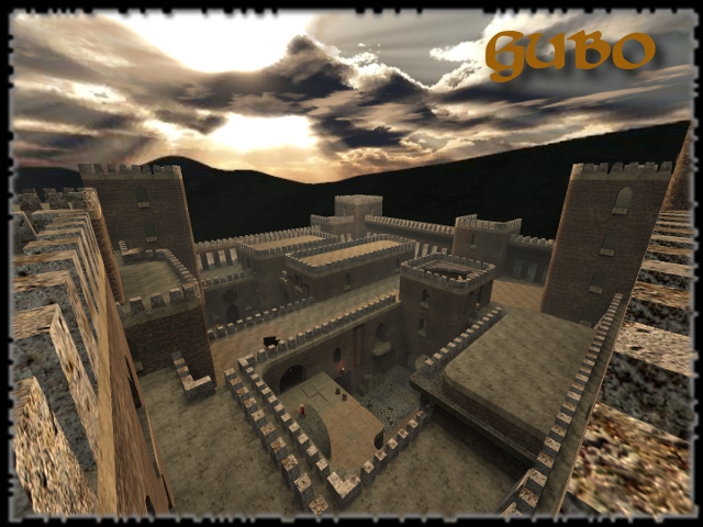
Not bad map, on first sight. Seems to be classic castle-styled...
It trully is a metl2 look-a-like. I'll comment more about that soon.
The theme is very traditional, castle. Would like to see some mix of another theme.
The texturing, is very brown. Not much contrast in it at all. This makes the texturing prety boring and too safe. Add some other texture than grey as contrast in it. That would fresh up the map a bit. Take as example the real mel2, or just metl3.
metl2 uses a lot of grey textured bricks, but also used grass (for more green in the texturing) and some blue (in the skybox) and for final, some red (as the marks on the walls, wich you also used but aren't having that much contrast because of the brown that your map is using).
metl3 uses a lot of brown and yellow, but also has a lot of lights wich are blue or red. The power of the contrast in those textures is that they get switched often, but not in a pattern. Like the grey textures are leading to grey textures, while for opposite happens the same. The theme is also not just 1, it's more industrial-egyptic.
Also, try to use the "v-commands" more often. Like as example, the ceiling of doorways isn't fitting the texture wich are on the walls or the doorways. My advice is to add another texture in those doorways, to create some more contrast (this also reveals where another entry to the room is, wich isn't that bad, because on that way your already getting "guided" to those doorways).
The geometry isn't bad, but it could be better. Those pillars in the windows around the map could be less detailed, since they are standing far away anyways.
There has been spammed immense with those white concrete blocks on the roofs. It doesn't make the map look that great since they look like they have been placed on the roof, like they are not a part of it.
The detailing isn't that great. I was expecting more ruined details.
The lighting is pretty safe either. There is a torch burning at the metl2 look-a-like corner (wich has in your version 2 rockets). That torch isn't convincing me that it really burns, when I look around that place. Make sure it lights, or don't at all. Not much contrast in lighting either.
I'm not very sure about the torches inside the map, give that huge blast of light. In those halls, there are several light errors either.
The clipping/noclipping is fine, nothing to comment about.
The flow seems to be fine, sometimes could be a little bit better, but I'm sure you'll notice that on your own.
The gameplay seems to be ok, but the metl2-look-a-like corner, is just a dead end. Everything leads to that place, wich makes it the ultimate camping zone. Especially when there are placed 2 playerstarts wich you are able to oversight when you stand at the other side of that platform, close to the health.
Dead ends aren't a great idea and probably never will be, because they cut down the flow and are killing the gameplay. In most moments during gameplay, if you can control a dead end, you win (take as example the highest platform of memento or the area close to the church-doors of duel7, where you were able to overview a huge part of the map, only from 1 point).
I'm not that font of the fact you also marked in this map all pickups...
Seems like you take a high value for gameplay and flow, but drops the other points a bit. Be sure to pay enough attention to texturing, geometry, detailing and lighting either! I'll give 5/10 for it.
P.S.
Is there any logical for such names?
