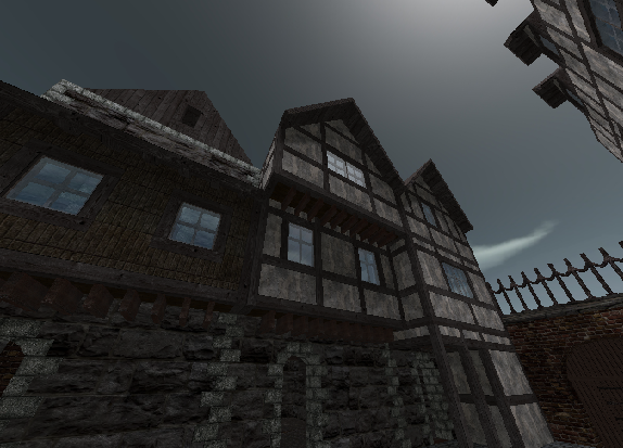
"Take a look to some mid-age images.(or an other time you think of when seeing this map) The houses have to be out of (big) stones and wood, the stone is almost all natural, no bricks.(Think of how much this houses would burn if there is a fire. In this time things like that were very serious)."
I do, actually. I'm honestly fascinated medieval architecture. I don't consider myself an expert, but I'm certainly not a layman - either way the helpful tone is very much appreciated. As for the presence or absence of brick, that was hugely dependent on the region. Poland and some of Germany are both good examples; there's plenty of examples of even early medieval buildings - domestic, military and religious alike - all over both of them. Brick wasn't a particularly rare resource.
"The geometry work is nice so far. Sometimes it is not so realistic because you copied and pasted too often, also you just have to throw away you laziness and give the rooms more atmosphere. :D"
Well then at least I succeeded where I wanted to succeed. As for copying and pasting, do any examples come to mind? I honestly can't remember doing too much copying and pasting, other than with the brick-framed row of buildings next to the descending street. Sounding condescending is the last thing I want to do, mind you, I just want to know if you had any particular examples.
"Also you really should care of what you are doing with a floor(I see you have made a very interesting but also very useless carpet. You don't see the detail in it really and it steals about 10-20 fps. :X"
Goodness, does it? I've got a pretty decent computer so maybe it didn't hurt my performance too much, and so I never noticed. Sorry about that.
"I have some nice ideas. One house could be a shop(one of the houses around that place that could be a market), another house could be a library.(Yes, I've seen that house, just add books(mapmodel) and some chairs, lamps... and remove some shelfs and the second floor)"
Actually that was the idea. Letting the player speculate about what each room is, and letting them fill in the blanks. Now you have me wondering whether or not that was a very good idea or not. xD
"Don't make it possible to climb up the tower. You can see there over the whole map .(and also the ends of the map)"
It is. The ladder up to the battlements of the tower stop just short of the roof hatch.
"Take a look to the size again. It's not much oversized, this makes the flow better, but because it is an artistic map you could lower some doors.(press "9" outside editmode to see your playermodel; again to hide)"
The way I measure is by considering each 1/2 cube to be one metre, meaning, for sake of example, most of the doorways are 2 metres high. It makes the player seem a bit short, but it's the best method of keeping a consistent scale that I've thought of so far.
"In your map are no entities. Do you know how to work with entities? Even if it is an artistic map, you need entities like lights, mapmodels, particles and playerstarts."
I do, but thanks very much for the concern. Manually assigning a spawn point slipped my mind. I'll be reuploading with an updated file in a few minutes that will have one added.
"I remember that you can jump at one roof from the ground and could walk away out of the map. I know this map is artistic but this brakes all realism."
Was it the grey log building with the white roof? The one with the balcony? If it was that was intentional. I've got a bit of a habit of always giving the player some way outside of the map, just as an easter egg. I have about four other maps that I did the same with (No plan of releasing any of them. They're embarrassing, frankly. xD) None of them have been death match or capture maps - why not, I say? :)
"Also only use noclips when nessecary.(on the marketplace the haycock for example it is a bit strange) "
That's a bit of an inside joke. When I was working on the tower a friend asked to see the map. He saw the red brick tower and said that it was in need of a viewpoint from Assassin's Creed. I thought it was a cute idea, so I figured why not? That's why the haycock is there.
As for finishing the map - I don't have plans of going back and updating the design itself, at the moment. Maybe after I've finished the map I'm working on now I'll add proper lighting and all else, but for now it is what it is. In any case, thank you very much for the critique - it's certainly much more appreciated than the two-sentence-long "good jobs" or what else that I had planned for. :)
