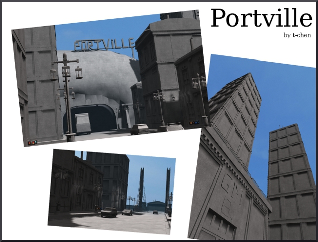
Hmmpf, people seems to forget that a texture can create a lot of detail either, without ballasting a PC much. Another advantage is that textures can be configurated way more than some geometry (scroll, pulse, shader, etc).
Anyways, about the map.
- The theme, isn't original anymore. Maybe it's the first really "playable" map wich only uses a lot of geometry and a few textures, it's getting pretty boring to see another map of this.
- The geometry is fine, exept that you should fix the water-skybox bug, by increasing the map 2x and take some cube away from the edges of the map. This somehow solves that problem (take as example 1 of the edges on techdemo).
The mountains could be less "dome" like, since they look like some cloud or something :S.
- The texturing is bad. Won't deserve any score (even I know it's a style, that doesn't matter).
It's maybe a nice style to use only a few textures, but it doesn't create the realism such detailed map should do.
- The lighting isn't that great. A lot of light errors on lanterns, lamps, etc. I'll give a solution for this without modifieding the lighterror at detail.
Some lanterns give incredible much light, while other really just don't, while there are giving light anyways. Please fix this since it's very unrealistic.
- The detailing is very nice, but some pieces could really just be models. Like lanterns or benches wich are completly in sunlight or just completly in shadow, could be modeled. If you would change the lighting settings of the models than you can create some fine looking models for the map.
- Clipping/Noclipping is fine.
- The flow isn't bad.
- The gameplay isn't bad, but some bases are actually only accesible on 1 way wich isn't flow-decreasing. Not really font of this but it's ok.
Since it's way more playable than other's of it's kind (and isn't repeating details), I'll give 8/10.
