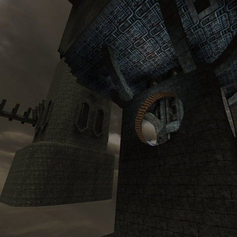
Hmm very strange. When you look at the map from a distance, the shape (and set-up) looks like "thetower" 0.0 (also 2 towers wich are getting connected by 2 bridges, wich some corners in it)!
The theme, eerm what is it? Some "darkness" or something :S? What about telling it in your node?
The texturing isn't great. Lunaran's textures aren't fitting the castle-brick texture and also trak5-textures aren't a great combination with it. WHy did you texscrolled some textures in a tower 0.0? It really doesn't fit.
The lighting, isn't bad but just boring. There aren't any lightsources at all wich breaks realism (like if there's coming light from nowhere, but there somehow still is light :S. Try to add for example lamps, torches, lanterns, fireplaces, etc).
The geometry is full of bugs. Look out when using different gridsizes! The ammount of wtr could be WAY LESS! 310k of wtr for such unsmooth and undetailed map is really wondering where it comes from, but after some research I found the answer, wich I'll tell at the flow.
Also try to get your circles more round, they are most times more like "0" shaped.
Another hint is, DON'T USE SMALLEST GRIDSIZE ON SUCH LARGE MAP, EVEN WHEN CREATING "DETAIL"! Like that fountain, very nice your tried to create something in it, but it's very unefficient. Try just mapmodels instead if you want some of that detail (just get some experience in that and you can really create beautifull things).
The detailing is pretty bad, because there is barely some.
The flow isn't great, because the map is just 1 big puzzle (wich breaks gameplay). You get teleported from room to room without even the ability to orientate yourself. Make the map more solid for a better gameplay and flow. Observate other deathmatch maps like curvedm, ruby. Those maps aren't great in detailer neither in geometry (since they are very old), but they rock at flow and gameplay.
The gameplay can be way better. For such big map there are way too less pickups. Going wild with materials isn't a great choice, especially when they make the map even more unrealistic and aren't increasing the flow neither the gameplay as well.
Make sure there is sense behind everything. Don't place just randomly some structure, wich leads to another randomly made area. Random in a deathmatch map isn't bad (since mirroring isn't natural either), but try to make it more realistic.
2/10 for now.
P.S.
Try to improve the image that you posted on quadropolis by combining several screenshots in it (like 3 or 4). Look at other nodes (or the "screenshot guide") for more tips and hints!
