Content
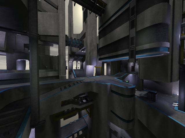
The screenshot looks very promising, but after I noticed the map is being almost 10Mb large, I started to wonder why such huge file-size...
Theme
The theme isn't original as it was, because there are already several other maps also having such similar theme (daylight space-like, using trak5 with several contrasts and curves). Despite that, it's not very clear to me which theme the map actually has. The skybox isn't making it easier on that either, as it's not very space-like at all, while trak5 textures commonly are.
Texturing
The overall texturing isn't bad, but there are often walls which are still pretty plain compared to other surfaces. I noticed also several texture mistakes which could be fixed.
Too bad you haven't played at all with shaders. You can make several textures fit the theme much better just by changing a few values.
Geometry
There are a lot of contrasts in the geometry, which can look pretty in some cases. But in several areas, it just doesn't feel right.
You also missed several geometry mistakes which can be seen clearly when jumping off the map (or being near the edge of it).
Lighting
The lighting isn't bad to me, but is lightprecision 32 really necessary? Using lightprecision 64 saves up half of the file-size (which would bring it to 4,63Mb; which is still a lot).
Next to that, there are several light-entities which seems to miss a light-source, but also light-entities which have a very odd balance between the light-source and the entity (especially when you check out the closest entity next to them). I would recommend to recheck the lighting as there are plenty more of such examples.
Detailing
There have been added pretty much details, but they all seem to be pretty concentrated.
You can definitely see that you've spend a lot effort on the details in the bases, but on several paths, it's like the map is still in some "layout-phase".
Clipping/Noclipping
The clipping/noclipping can be way better. Some trimmings are noclipped, while others are not what about noclipping them all? It's not like the map would be very flat when it would be noclipped.
The metal plates in the bridges could also be clipped, as they are pretty annoying to walk over when aiming.
Flow
The map has a pretty interesting flow. You can notic you've spend time in making the flow right, but sometimes it seems like you've tried too hard.
As for example, when taking the "lift" and "bunnyhopping" to a base, just makes you bump into the fence of the balcony above the base.
When you try to get on the opposite balcony at the same base from the platform which the flag is at, it looks like you can jump on that balcony by using the pipe as entrance, but you *just* can't make it; which feels odd.
The jumppad (which isn't marked at all, would be very nice if it would) below the base which launches you to another platform is being too powerfull, as I always miss the platform and fly over it when I run into the jumppad. What about fixing such issues and recheck the flow again?
Gameplay
I noticed the pickup placement is pretty odd. There are several pickups which are lined up like that, that you've got like 60 bullets in just a few seconds (or 15 rockets). What about spreading them more and adding more variation between pickups?
Overall
It's a nice start, but there are several things which could be improved. I'll rate 7/10 for now.
