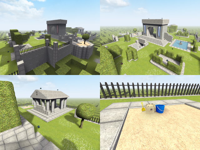
C'mon guys, not everything Nieb touches is gold.
Nice idea for a theme, but overall this is too simplistic. The layout is atrociously basic, and symmetrical in at least two directions with no attempt at making either side seem different. The hedges are too cubic (realizing they follow a similar form in reality) and could stand to be rounded out.. The ones in real life, while being cubic, have a distinct 'softness' to them because they're layered. Here you're only working with one layer - the texture layer.
Back to the layout.. The underground tunnels don't add a HUGE element of verticality to the map, which is distinctly horizontal.. And you've created a lot of camping spots that may make the map annoying to play in. My suggestion: you've already introduced the idea of a hedge-maze. Why not further the theme? Make the layout more twisting and turning and tight with some open areas. This map, with the exception of a few obstructions, is very open.
The textures/models added are pretty nice. It's nice to see things being added to sauer but realize the folder's getting DAMN large. I'd advocate more versatile mapmodels that can be used in various themes - sci fi, for instance, can make use of none of these, and sandcastles/pails are a little childish for many themes.. etc.
Considering there were four accomplished mappers involved here, I'm unimpressed with the final product. The textures/models are nice, but if that's the only thing then you might as well release them as a standalone pack.. Unfortunately that doesn't get as many downloads as a map. lol
