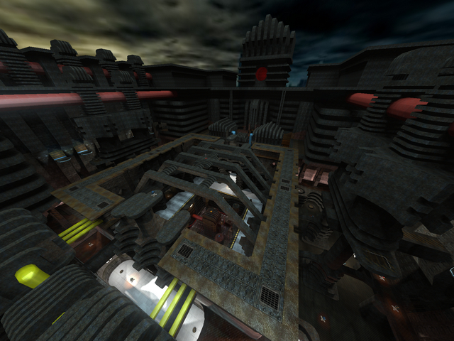
Interresting map...
Nice themeing, pretty original ^^!
The geometry is fine to me, sometimes it could be a bit less blocky, but I don't care since the map already has pretty much world-triangles and it doesn't breaks up realism, flow or any other things.
The texturing could be a bit better. The plain metal-texture of lunaran ("glue1") has been used to often. Try to use some more textures wich look similar to it, but are different or are just fitting the geometry as well.
There are pretty much textures wich aren't fitting their geometry properly (like the "mm-concretetrim07a" in a doorway, wich wouldn't even fit when you rotate it 90 degrees), try to change this.
The lighting could be better on some places. It's a bit dull since there are places wich are yellow lighted, but also green and red lighted. This looks pretty strange. The brightness of the atmosphere is fine to me...
The detailing isn't bad. At some places it could use some more but since it looks more like an abstract map than a realistic one, I don't care...
The flow is fine but could be better. Some parts aren't fitting each other when jumping and running around. Try to make sure you can have a jump-pattern for navigating trough the map.
Sigh, I knew my idea for using a jumppad to the flag would get used before I would be able to release my map. Ah well, mines still original compared to this one :P.
Gameplay could be better but is fine for now. Could test it when waypoints would added :P.
Anyways, still some points to do.
I like the theming tough, some tubes/cilynders could be more finished but overall, not bad. I'll give 7/10 for it.
