nice,
it seems to grow to a good map :) , but I dont really like:
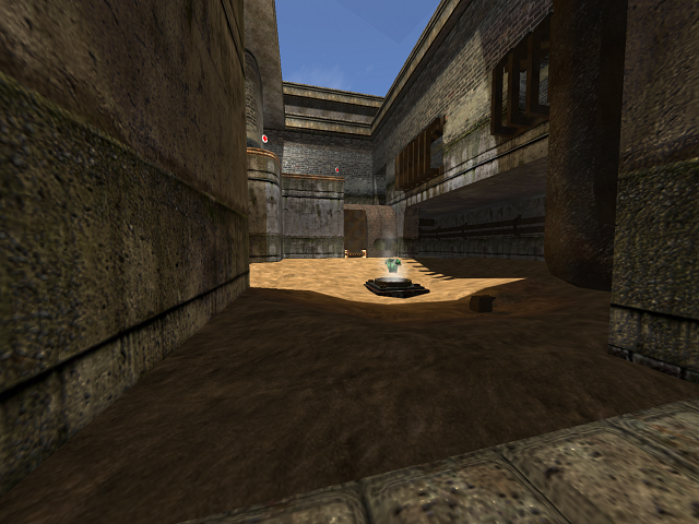
-your lights (it should be a more darken map i think, show the players how tirdy it is!-> darker and more green, with less sunlight)
-same for the sky
-the water, (if it is a tirdy map ;D) like watercolour 0x000300 and waterfog 5
hmm, i think its an effect that it isnt finished yet, but at some spots the details look really good (the teleport,the pipes, jumppads ...) and at others... (eg the upper room with the big windows hasnt got any detail)
aand: whats this hole in the wall in the lower floor? Do u want to clip it or put sth like quaddamage into it? you have to clip muuuch more.
The layout is really nice, i like the holes in the wall where you can look through and the place you can jump over the corridor. but the teledest are located wrong, i think -> if you hear a teleportsound of an enemy you now he is in this dead end-> you just have to camp. why dont let him appear in room and make other possibilities to hide?
Also the connection between the upperfloor and the lower one: at the spot with the water you have to riflejump (very bad choice if you fight with an enemy), in the big room are only two ways up: the teleport and the jumppad and both possibilities let you appear in the same corner. i would like to see another jumppad or stairs...
greetz a_teammate
