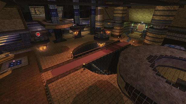
So can you explain how you make it is present in a map?
anyways,
the theme of this map... eerm sorry but there no theme? try to stick to 1 or 2 themes (recommented just 1) after you finished the gameplay and flow...
the texturing can be done better. It's not a smart thing to use like all kinds of textures wich carry all a (very) different theme, especially when some do have shaders and some just don't.
the lighting is bad either. It has a very unnatural atmoshpere. When you run arround it feels like your just in some kinda chamber everything else says something different.
the geometry is actually the best point, even tough it's not something te be proud of...
the detailing, there's like no detail?
clipping/noclipping, since there aren't much details present and geometry is very basic, it's not hard to have a proper clipping/noclipping...
the flow isn't great. The map has a lot of flat surfaces wich some platforms where you can jumpspam on. Try to make you can acces room without jumping, since it makes it more exiting to have several ways to a certain position, instead of like 3 similar ways.
the gameplay isn't nice either. There hasn't been thought properly about the places of the pickups...
I think you still need a lot of practice. It's not a bad thing to put such map on quadropolis, it shows how far you skills are (and maybe just by your own, with only a tiny little help at max, like I do). I won't rate it because this just shouldn't get rated...
