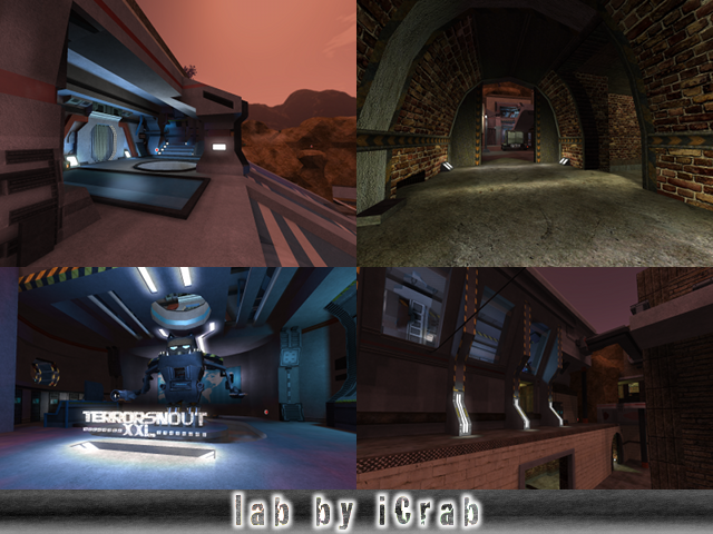
After I took a look at the map noticed:
The theme has been created carefully, wich is good. It's not like a bunch of "sub-themes" bundled together, even tough it looks on the first sight.
The texturing could be done better. Try to set up an own config-file for the map ("lab.cfg"), so textures can be edited very easily on appearing, position and size (wich cant all be done ingame, without config-file). Because it would be a pain in the ass for doing such thing now, try to use "vsize" at some textures, so they fit better on the geometry of a detail.
Try to use a few (even just 1) texture for glass, because it really looks very weird to have like 10 different kinds of glass, in just 1 map (it's very unnatural, since in real its not like that either).
The lighting is fine, exept the lighting outside (on those mountians) is definetly not fitting the skybox.
The geometry is nice, nothing to say about.
The detailing is great. Almost everything is handmade, wich is nice but at the other side, it eats wtr. Try to use mapmodels instead (like there are default barrels, lamps, vavles and boxes wich are fitting this theme perfectly). If a mapmodel isnt in the right position, try to set up a costum config-file for it (md2.cfg, md3.cfg, md5.cfg or obj.cfg. Depends on the model itself). So try next time to use some more mapmodels!
The clipping/noclipping is fine, nothing to say about either.
The flow can be sometimes a bit better. Like there is some sort of cave (with weird brick-textured ceiling and wooden walls), where you bump your head to the ceiling when jumping.
The gameplay isnt bad, but for this size of map, way too low ammount of playerstarts and pickups! It's very easy to camp at a playerstart since there only 24 of them. Try to have an ammount of 5 at each pickup instead of 4 (even tough, observate the situation of where your putting it first, then just senseless putting it somewhere, just to have a same ammount on all pickups).
You can notice very well the map is based on a realistic floorplan, since there are way less tactics spots in it than usuall maps. This isn't a bad point, even tough it most times isn't working on sauerbraten since it fast movement.
The name fits the theme, so nothing to say about that.
Maybe some very nice tip, try to add sounds in the map (by making a costum config-file). This makes it much more realistic and enhances the map greatly. Take as example a waterfall-sound near the "waterfall".
If you dont know how to do this, try to look at "edit-reference" on "sauerbraten.org" and observate config-files of other maps.
For overall, this map is very nice. There still some work to do to make the map really perfect, but it's like 85% done, so good job! I'll give 8/10 for it...
