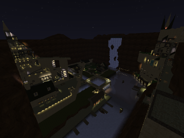
pretty interesting map, when you look at the screenshot...
I know its a conceptual map, that's why I can still vote on every other point than gameplay and flow...
Theming is pretty original, even tough it has some rpg-style or a bit "sky-castlish"...
The texturing can be done better. There are a lot of textures wich arent fitting each other. A nice tip for your next map is to make a config-file for the textures. Because the default texturepallette isnt showing all textures and not all optional positions of textures, your possiblities for texturing gets reduced (as example, the wrong textured wooden fences and trimmings).
The geometry can also be better. Ground is just flat, wich is very unnatural...
The detailing =isnt great either. There aren't any sounds at all (wich can really make a difference in such kind of map). This can also be done by adding into a config-file.
The lighting is bad. From a distance (like on the screenshot) it looks fine, but when you look closer, it's way too bright, or just way too dark. Try to use less intense light at the entities that have a big radius.
Try to look at rpg-maps or some conceptual maps from older releases, like "fanatic_caves" or "fanatic_complexities". They could be very helpful for improving this map...
When you make such conceptual map, make sure any other persons really get the idea of "wow, that really looks great!". That's why I wouldnt recommend it to mappers wich just have started editing...
