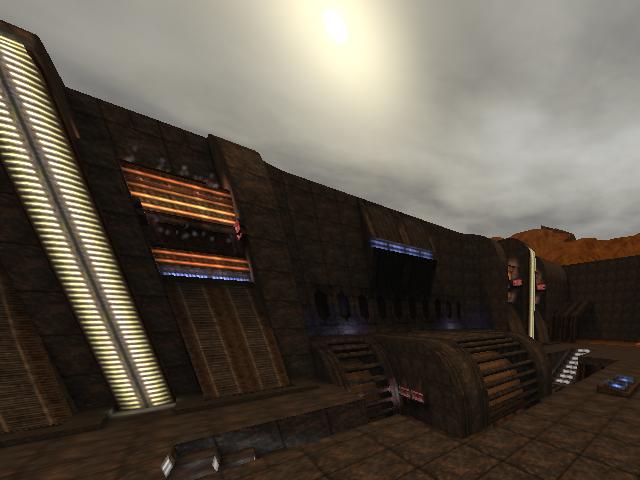
About the map...
The theming isnt present actually, even tough its like a turbine remake. It's like a mix of a cavish, industrial, spacic map. Makes it pretty unnatural. Try to stick to 1 theme instead of many...
The name doesnt got any sense at all, because like your saying it has dynamic lighting, it doesnt has because sauerbraten isnt supporting such thing (only at muzzleflash, but not at mapping). When you would have used "pulseworld" or "pulseglowworld" as shader for textures, then it would have at least made some sense, but now it just doesnt...
Btw, It's not original to take "core" in the name of your map, since Kretren used it often already. Try to take something different than "stealing" parts of someone's names...
The texturing is pretty undetailed. A lot of textures has been used, but they just dont fit each other (like you've used the trim-texture "064-20b" of techsoc, as wall-texture in hallways, spamming light-textures on walls, etc). The light-textures like "032lig20yb" of techsoc arent using a glowmap on default, but they can have a glowmap if you set up an own configuration file for the map (wich is pretty common to do and looks much more proffesional. Besides, you learn how to assign textures and how different shaders can be used too).
The lighting is pretty fancy, but its sometimes way too big compared to the size of the light-texture. Add a different (a bigger) light-textured to such place or decrease the light. Try to create an atmosphere, not just some lights "wich could fit each other".
The geometry isn't bad, but could be much better. When I look at the ammount of world-traingles, it seems like you havent used them efficient. This map looks like it only has like 40k of wtr at max, but instead, it has 124k of wtr! Try not to use the smallest gridsize and remove things wich arent in sight of play (like pieces of the mountains). With a lower ammount of wtr, a map gets much easier to play for players wich have an older pc.
Another hint is to decrease the detail of those bars wich are above the "running" sand. Those bars are made with the smallest gridsize, while they can be made with 1 gridsize higher (without losing that much detail)...
The detailing isnt great, because you've repeated a lot of geometry/lighting/textures multiple times. Try to make places unique, this makes it less confusing for player either.
The clipping/noclipping can be done better. Your able to get on the mountains by some trickjumping pretty easy. You commonly get stuck at arches or lights in the map.
The flow isnt nice. You bump against ceilings pretty often and there are very long hallways. This should be avoided because its annoying and boring. Try to add more layers of platforms/areas in it, instead of using long hallways to connect rooms wich have a huge distance between each other.
The gameplay is bad. No pickups added and because of the flow, the gameplay is really boring. Havent checked the playerstarts but I'm not expecting anything good from it either...
I wont give this map a high score, just because its not deserving to be high ranked (yet). Maybe when its more finished...
That's why I'll give 2/10...
