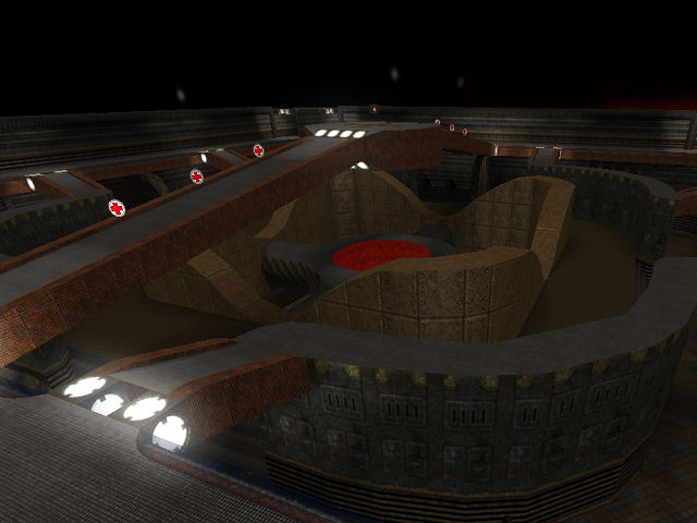
Oh wow. Where do I start?
First of all I want to say a big thank you to you, that you took so much time to analyse the map and write such a detailed critique. I think that's the best thing that can happen to anyone creating stuff (be it maps, paintings, music or any other kind of artistic expression).
Skybox: I'll try to fix that for sure. I don't think I'd be too happy with staffys skybox simply because I want to have the earth and the moon above and below the map. I'll see if I can improve it.
Layout: Well, what can I say. The map was specifically designed to give you only a minimu of cover so that you have to keep moving (thus the lack of boxes. I tried that in versions befor this one, but I thought it didn't fit). About the jumppads: Originally I only had one jumppad (the one in the middle) and the teleporter. The problem with that was that it forced the main focus of the map on the lower platform resulting in a 0 to none use of the top level. At first I build stairs at the side, which weren't too bad. The only problem was that it took too long to get up.
About the look of the map: When I made this map there was a trend that the buildings in maps had to be somehow 'broken' (like broken floors, walls etc.) to make it interesting. I explicitly wanted the complete oposite. Everything should look like it was (more or less) brand new and in a exelent condition. But this also leads to the problem that I denyed my self a very good source of detail that could've made the map a bit more interesting. Anyway, I'd really like to work on this map but I have to serious problems with that. 1) Don't got the time to work on a regular basis on it 2) I haven't played Sauer for over a year. I had to look every thing up again ( ._.). That's also why I said that if anyone wants to take the map and improve/change/redesign it they are free to do so. Same goes for the skybox.
Textures: Ah ja, the textures. That was a pain in the ass. They were only somewhat of a compromise. Originally I intended to have textures like in Bioshock 1. I've tried all textures there were at that time (I think there are more now), but you have to see that I started building this map with the release before the last one. Anyway, I'd LOVE to change them. I just don't see that there are any better fitting ones (Although I have to say that I didn't try the textures from the latest release. Maybe I can change them a bit, dunno. I'll try).
Lighting: What can I say? This is something that, if I tried to change it now, would only look even worse. I wasn't very good at lighting back when I made that map, but I'm definitely WORSE today. I know what you mean though and I agree. Also, if you wondered why there are some lights at random places without obvious reason, I remember putting them there because of errors in the lightmap after calclight (independent from the level of detail for calclight). I didn't know of any other solution for this.
What ever, for the lightning I'd definitely need help. I couldn't do that alone anymore (but again, that's why I said that this map is free for everybody to edit. Maybe I should rework the read me and make that clear)
Detail: I always felt that the map lacks detail. I'm not sure I can change this anymore, but I'll try.
Again, a big thank you for such a detailed critique. I know what I can try to change/enhance and I'll start with the skybox. I'm not quite sure if I'm able to change any of the other points, but your post definitely makes me want to try again.
