How could windecker be able to upload a map if he doesnt have it? (or does he? :P)
Now back to the map,
Not that original theme at this moment, but ok fine to me...
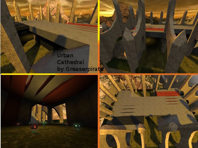
The texturing could be done better, its very abstract. Use some more textures instead of only a few.
The geometry is for its theme pretty great, just 8k of wtr isnt much at all. Even tough, try to add heightmapping into the grass, because it really looks flat wich is very unnatural. Take the geometry of authentic as example, to give it a better feeling.
The detailing hasnt appeared yet...
The lighting is far from done. The big light-entity in the sky isnt matching the skybox, try to let it match by using the /yawsky command...
The clipping/noclipping still can be done better, you able to get above the clip by some trickjumping...
The flow hasnt appeared either. There is only 1 way to get up on each base side (wich is a ramp. Really, dumb those ramps somewhere you cant find them back anymore, because it really decreases flow and gameplay. Use jumppads, ladders or teleports instead!) and only 2 ways to the flags.
The gameplay is far from done too.
Try to work more to the theme, so someone else really thinks that he trully is playing on an "urbanic" cathedral...
Ill give 2/10 for now. You really have to learn that only when you think the map is really done, you should upload it on quadropolis (else youll get comments like this, with a lot of things wich can be done better). Even if you think its really done, you'll find out its actually still improvable anyways...
