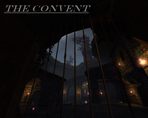
Rechecked the map again (the updated version) and noticed this:
You took some of advice from other mappers, good job! Still, there are many advices you didnt take, wich could improve the map greatly...
The lighting looks already more finished, but isnt done yet. There are still much places wich arent lighted at all, while it isnt a problem to put a light over there (like at the corner close to a grenade spawn area. I would suggest to add a (logical) light inside the sewers too, so it get revealled a bit more).
Even tough you didnt took my advice of lighting properly (put 1 small but intense light to the lightsource and a way bigger but less bright light, some distance away from the lightsource. Observate the light entities (ONLY THE LIGHT ENTITIES! DO NOT OBSTERVATE OR COMPARE ANYTHING ELSE!) of maps like metl4, mbt10, powerplant or even fi). It would create a less dark atmoshpere either, wich isnt bad when done properly (its too dark at the moment).
The texturing still could be a bit better. Like i said before, the 2 white/grey bars that are in the middle of the height of some houses, take 1 bar away or resize the bar to twice as big as default (use "vscale" for that).
Some texture errors can still be fixed (like the "curved" ceiling at some places. use "vrotate" to make it fit the vertical side).
The geometry is almost the same, i still think the map would look better if the mountains above the map are a bit more round, to create a more natural feeling (its not bad at the moment tough, just could be a bit more better :P)...
The detailing has been increased too. The castle with the fence isnt a bad idea, even tough i really got some question marks what those bulps are in the fence :S.
Nice work you took the advice of mapmodels, because mapmodels can be rendered cheaper as it would have been made from solid cubes (you can make details anyways, by using the "writeobj" command. This just makes from your creation of cubes, a mapmodel (too bad not textured. I dont know how to texture this properly, because i cant set that right yet either :S. If someone who reads this do knows, please put it in a comment on this content or contact me). The nice thing of a mapmodel compared to solid cubes is that you can rotate it in any direction you want (even tough the z-axis by using obj.cfg). You can also make it spin or use it as a trigger in singleplayer (as far as i know, when coded properly). Even tough, the bad thing of it is that texturing is like i already said, much tougher :S.
Clipping/Noclipping has been increased as well. Good job for clipping the map intirelly so players can get on those mountains anymore. Still putting some question marks why you added a bar of clip vertical on the stairs close to the sewer (but just 1/8 of a default cube just before the stairs, right next to the wall, this will prevent you get stuck there, even tough only partly).
The flow is much better now. I like the solution of those stairs, because it fits the theme of the map and it also makes you dont have to jump much (thats actually a pretty important rule when it comes to flow. Jumping is nice, but should be tried to get avoided when its unnecasery. Of course this isnt the meaning you should add stairs everwhere, just several ways to a specific area, wich you can reach without jumping. Its not bad to add a way to that specific area where you do have to jump, but it shouldnt be a primary way).
The gameplay went a bit up too. Its less confusing now, wich makes it easier to play and the YA finaly is on a proper spot where it should be in such map, nice work!
Good job! Nice improvements, but still not finished! Keep it up mate, ill give 6/10 now (because lighting and texturing and detailng still can be done better)!
Edit:
Forgot to tell,
like i already said before, try to create a more broken atmosphere, because it would look more natural...
