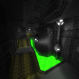
After reviewing the map, I found out the following things;
Theme
Seems to be some space-like, not original but seems designed "correctly", as it fits the rest of the map.
Texturing
The map seems to have used a lot of textures and fitting each other in a subtle way. There are some rooms which could have the ceiling some more fancy-look, instead of just 1 flat surface.
Geometry
The geometry fits to the theme pretty well, as round would create a more natural feeling, which a space-like map shouldn't have in general.
Detailing
There have been added a lot of details into several rooms, but there are also rooms which are only containing 2 lamps and the pretty detailed doorways which separates them from other rooms (which do look better). Be sure to fix this as those rooms looks pretty unfinished.
You doesn't seems to have added any other light-sources as the original chamfered cubes, which are appearing in almost every room. This makes every room look pretty much like each other, kills the realism (even it is a space-themed map, some realism is always necessary) and makes the room look pretty boring.
Lighting
The lighting seems to be improved very well, but in some rooms it is overbrightened (the lighting looks dull). The rest of it just looks fine to me.
Clipping/Noclipping
As Sauce was a helping hand, the flow seems to be increased greatly by clipping (and noclipping) doorways and such.
Flow
The flow seems to be fine, but the layout of each rooms is almost the same in every room; there are 3 to 4 doorways, 1 (or 2) on the lowest floor, 1 on mid-floor and 1 (or 2) on the highest floor. They are always connected by stairs which are positioned in an angle of 90 degrees towards the lowest doorway. This makes every room pretty predictable, even the distance is different sometimes.
Gameplay
The pickups seems to be placed pretty odd, as there are 3 YA and only 2 GA. That's like incredibly much for a map which is notified as a recommendation with an amount of 9-15 players. Even more odd is, there are just 6 health in the entire map.
When putting health and armour, think like this:
When a player has low health,
- He will play with caution some more (which is a good thing in overall).
- He won't go into combat that quickly (which is a side effect of that and less good, as it provides camping).
- He will go look for health instead of actually playing the gamemode (as for example, ctf).
When a player has a hight amount of health,
- He will attempt to attack way quicker.
- He won't care about his health that fast, as health is being spawned close to him soon again anyways.
- He won't actually play the gamemode either (as for example, ctf) as the player will probably spams around his munition.
So keep a balance between that, make the player keep being hungry for health, but provide him just enough so he can put a (counter)attack on his opponent as well.
Keep a balance like 1 health to 2 players as minimum (so like 8 health in this case) and 1 health to 1,5 player as maximum (so like 10 health in this case). This always makes sure players won't be stacked all the time with full health, but aren't letting them being killed that easy.
It seems like you've putted every pickup in a corner (especially on higher platforms in the rooms), which isn't very tactical at all. It's not a bad thing to make a player reveal himself before having an actual weapon. This creates a layer of knowledge when, where and what pickup he should take to kill the opponent which is near him (like the next room).
Overall, it's a pretty nice map and every room looks like each other, but still has some different detail which makes it yet individual. I think it still can be improved, that's why I'll rate it 8/10 for now.
