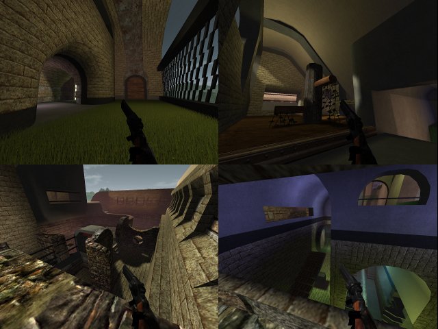
its a nice map, but make sure people know what to do and where to do. like adding some sign (like an arrow above and a word like "jump!") that youve got to jump your way up at the first obstacle. you actually should think that at every step that the player should do in the map, he needs instructions what to do.
to do such thing on a very cheap and easy way (and it looks more proffesional then adding signs), add a demo (as a tutorial) in the zipfile (or as attachment), where people can really see how you should prevail the obstacles.
the "no-editing" script sucks to me, just because if you would modified the cfg (or just delete it, the cfg doesnt hold any textureset anyways), you could check out how the map really is build up (this is actually a secondary intention of edit mode and a primary need for commenting the map).
by just pressing /savemap glitchrace2 and then /map glitchrace2, gives the same result.
a note in the content on quadropolis (or in even in the cfg and/or maptitle) that you shouldnt be in edit mode on the map would be enough, because you actually fucking up the freedom of editing.
like the license is telling, everyone is just free to do what ever they want to do on the map, as long as when they copy, distributing, showing or modifieding the map, the name of original author has to be showed up somewhere. so if someone really hates the "no-editing" script, he can modified what ever he wants, just because the name of author is in the maptitle and in the cfg.
i dont see any theme in this map, so i wont give much points for that.
the texturing could be done better. some textures (like of the stairs at level 3) should be turned 90 degrees.
by taking a theme its much easier to take a preticular textureset too.
the lighting isnt logical at all. there are lights but no lightsources, or the lights are just very bad placed. the only logical lightsource is that placed close to the sun of the skybox.
again, when you have a theme, you can move the lighting to that theme.
the detailing isnt good either, there arent any details exept the signs "level 1","level 2" etc...
the geometry isnt bad but could be done better too. yet again, take a theme and stick to it. this makes its so much easier to edit and to get a proper map, even for a race map.
there are unnecasery structures in the map, wich shouldnt be in it at all, just because the player isnt getting to see anyways. just delete them to get a proper map.
the fog isnt logical either, no reason at all why its pink and even less reason why its even in the map.
clipping/noclipping could be done better. when you have saved your grenade up to level 8 a hole part of the map gets free by just an easy grenadejump.
the map isnt logical set up too.
your suddenly a cheater by taking marked teleports in the rooms wich are connected at the teleports (with "level 1","level 2", etc on it) in the room at the right of the playerstart.
when you try to break the a "level key", you can get back and your stuck for ever. this is actually against the principes of a racemap too. there isnt getting told anyways that you can skip a level by breaking the level key anyways.
there isnt an actually end on a map, wich is a need on a racemap.
the map is pretty original, even tough there so much race maps already made before, wich some of them just way much better.
lets just but it in an easy list
theming 2.5/20 points
texturing 2.5/10 points
lighting 5/10 points
geometry 5/10 points
detailing 2.5/10 points
clipping/noclipping 2.5/10 points
gameplay 5/15 points
originality 10/15 points
this map still has a lot to improve. i would recommend to just start all over again by building a racemap. 35/100, so rounded up (and scaled down) to 4/10.
