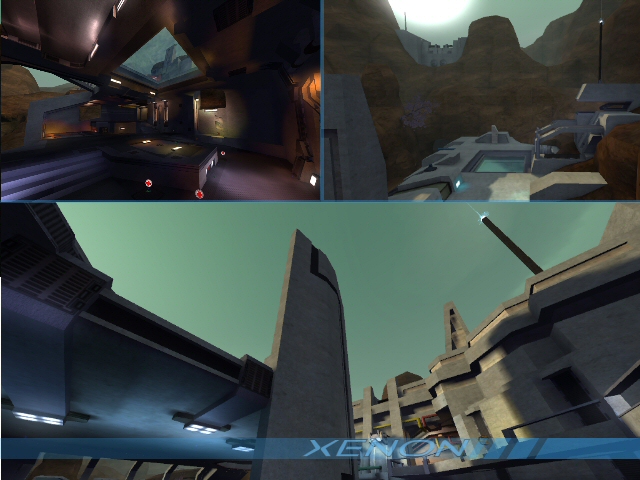
I didn't know about the flowers.. But then, I never got damaged.
This was interesting to look at, and well worth warranting my comments.. I've not posted on many maps recently.
Interesting theme, great details in some parts, and overall solid map.. There are a few things I'm concerned about though. First, there are ALOT of small details that could be noclipped/clipped. Specifically I'm talking about the 'cables'.
The buildings are okay. Some are way more interesting than others, but almost all are completely plain from the outside, which is disappointing. The lighting is REALLY vivid in some parts, like where you use blue lights, so I might suggest toning them down a bit. Also, the Trak5 set's defaults make them really shiny in-game. I repaired this in core_refuge's .cfg, so maybe check that out. As it stands, they're shinier than logic can take, reflecting the sun even in the shade.. Also, you had a choice to use glass (which is thankfully now included in Sauer!) on curved geometry. In some parts, like where you have a glass wall with a 45 degree wall coming from the top, it makes sense to use it. I haven't tested the cubeglass thoroughly, but I think it would fit here. Also, you made glass 'shields', lined up along the edges of some buildings. They're all different shapes and sizes. Given that there is no symmetry in the arrangement of these shields, they seem quite random. I realize that they're actually just flipped or reversed, but they still seem random.
When you do get to texture blending properly, I'd suggest keeping the glowy blue moss on the insides of the caves. This texture seems like it would be some rare, fragile moss that would die with direct sunlight. Also outside, where other light is present, the moss doesn't have the same effect. I don't really like the combination of the brown rock and the blue moss, personally, but that's your call. It might be better with a grass base, then blue on top.
While I didn't playtest the map thoroughly, I did find it to be a massive map. Taking the most direct route I could find (and there are alot, and it's easy to get lost.. You probably know it better than I do) it took well over 25 seconds to get from flag to flag. That's almost a minute to score if nothing goes wrong. At this stage there's no way to fix that I guess but I'm just concerned about the size.
You put water in really high places that, chances are, nobody will see. These can probably be taken out.
Above one building is a floating fern.
The antennae sticking out of the buildings are rather ugly imo. They're chunky and at the top is a strange particle ball that looks really fake. I've seen this in some of your past work as well. I prefer using a slimmer, rounder antenna but it's your call.
I saw a lot of attempts to combine different textures (philipk, trak5) and architecture designs (sharp angles, round objects) - in some areas, spot on. In others the two don't seam that well.
This map is probably playable but it of course requires a lot of players to make it fun. Aesthetically it isn't bad but there are alot of small details it falls flat on. 6/10
