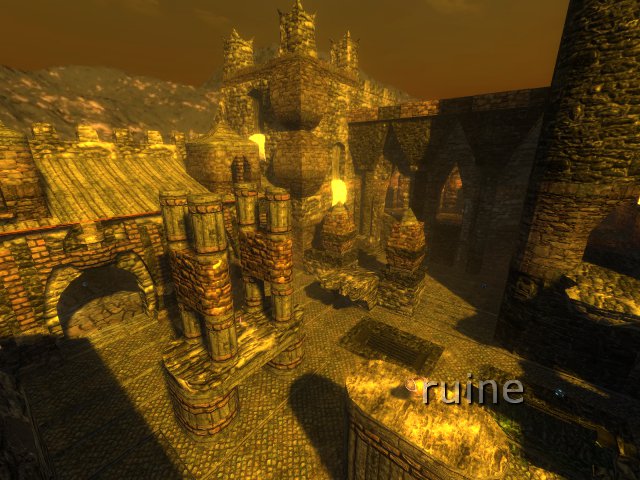
id say. you have almost no clue about gameplay and layout. the map might look pretty "nice". but the gameplay is a bit boring in my opinion
also things like these 45 degree slanted walls which are supposed to be "ruins"
also the blocking on the corner where you cant fall out of the map is bugging me.
it breaks the illusion totally.
it stops people from exploring, a thing what i always mention in my maps. you should enforce players to explore the map.. not restrict views from undone or skycubed parts.
i dont really like maps where you have too many opportunities to fall out of the map (like in nmp8, thou - its a cool map and has nice gameplay)
but dont give curious players the chance to take a look just breaks the illusion of a castle.
its like youre a little child who want to explore a castle but you need to stay by your parents so you dont get lost.
this what this map makes me feel :/
some Corridors are way too narrow especially canals.
The flow is in my opinion pretty limited and narrow..
the details are nice. at least the curves.. but i dont like the ruins on some spots.. they are too bad slanted and in too big cubes (and always in the same cubesize)
