the good:
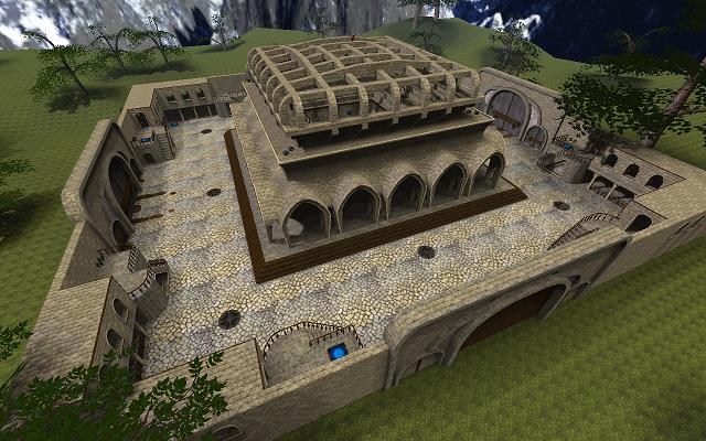
*some building looks nice.
*lights are fine.
*textures are fine.
*nice details.
the bad:
*bad layout
*the maps is practically copy and paste.
*the map look like a box thats a fatal error because the map looks boring and lost all his sense.
*the background is not bad but still be a box.
*the gameplay is bad because the inside of the buildings are too narrows and in some places is open (each corner looking at the other corners).
*the skybox dont fit.
*some weird forms.
Conslusion:
artistically the map looks nice, but its deathmatch so for me is not really important.
the light and the appearance of the map is good.
but first in a deathmatch map is the layout and hence the gameplay, after that you can make details and make it more beautiful.
my vote is :
4/10
delightful
