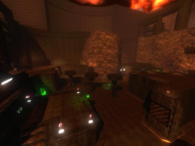
a nice first look and following things :
+nice design
+good gameplay
+also good "jumping-quality" (you can jump almost easily to every place at the map)
+fitting textures
-just two levels (floor and upper stage)
-some places look very undetailed and unfitting
-some cubes at your pipes arent placed right
-mountains could be done better
-the green places and the green jumpapds doesnt fit the map
Result : the last time i saw some of your maps and i have to say :" you got potential "
You are not perfect , but your basics are good. At this map you could add more details especially at the outtaside, which looks really empty. Try to diversify with the textures and try to kick out the sucking green places ^^. The lightning fits the map well , just the green places break the atmosphere really hard. All in all a good basic , where the chance is given to create something really good. But first you have to do my critics pls ^^. I´m looking forward to a new map by you and give 6/10 at the moment
