Mysterious | 2010-05-02 12:36
Dastan
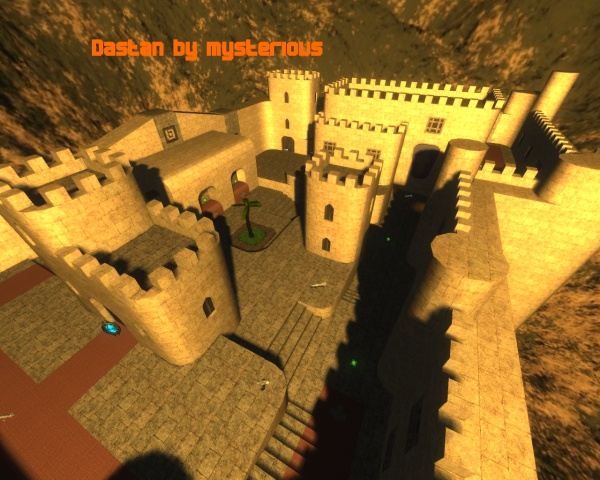
Dastan , the persian prince
Because i´m looking forward to the new "Prince of persia" - game and the movie , i had the idea to built a map which remembers me to it a little bit.
So Dastan (the name of the prince in the movie) came out.
So have fun running around the map !
---------------------------------------------------------------------------------------------------------
improvements left to do :
-correct lightning mistakes
-maybe add some details
---------------------------------------------------------------------------------------------------------
Update 1 :
-added quad and health
Update 2 :
-changed lightning (now sunlight)
-added bloom
dastan.zip (251.72 KB)
login to post comments
