i hate to do this:
Mhelenurm is right this map pretty much sucks:
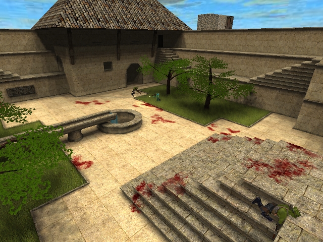
Texturing: i understand its a work in progress. To Start off the texturing is so boring. You need to work on the about of details in the texture. I would at 4 or 5 differing types of brick to spice up the map. Using differing brick in different areas of the map. Also the texturing for the bets and for the furnisher in the rooms look bad. Look at maybe using map models rather then creating it your self.
Light: is a mess; it feels like a fullbright map. Work on my dynamic form of light. I suggest to maybe use an rising or seting sky map, this way you can use a more orange light across the map, and therefor create a better mood for the map. The map need more stuff; as though most people would not say this is a lighting problem, it is, you need more stuff the produce light to very the amount of shadowing on the map.
Layout: One word "TRAIN WRECK". The layout is so boring over used and really honestly not that good. Look at other garden maps on quad, they are a lot bigger grander and over all better. The map loses majority in my book on the content of the layout. I would take the ideas you have expand it then add more garden elements (trees bushes shrubbery, fountains, etc.) and divide your garden into section, not equal section but defined sections. This will help improve your map.
Detail: well i think you and i know that you need more :)
Clip/noclip: as for this map, the ledges need clip (the overhang on all pathways). The outside walls need raised and then cliped, it looks by when i can rifle jump but can not land on the wall.
Cover/sections: opening the rooms will help this, also adding a rail on the top level will give some cover too. The problem right now is that i get shot from bots on the other side of the map, its far to open.
OK i don't think i need to add any more.
Your Lovely Troll
chasester
Ps: ill rate this a 3/10, but i will not rate it on the site, since it is a work in progress :)
