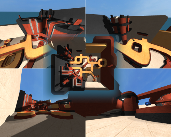
pretty nice map, looks like it has been based on a map of warsaw or some game like that :P.
the theme isnt that original anymore (maybe because lots of people are using it in a short time :S) but thats ok because the textures arent in any official release yet.
the lighting, could be better. its very overbrighted, what lacks the contrast of shadow and light.
DONT PUT THE LIGHTPRECISION ON 1!!! put it as lowest value something like 12, but thats it! i know its very nice to have ultrasharp shadows, but that isnt very realistic either and makes the map has a incredible big file-size.
a bit skilled mapper should be able just to keep light precision 32, but because of the theme and the geometry, it seems pretty tough on this map.
it looks like you dont got that much experience with lighting yet, because you putted 2 huge lights with a value of RGB: 255 255 225 (this is why the map is overbrighted actually).
if you want to make this at least a bit realistic, put it something like 200 200 200 at max (just dont take the highest number thats possible with such big radius, you got a very high chance the lighting will suck).
the programmers have done a very nice develop in lighting once, if you set the first parameter of the lighting to 0, it will be on his max radius. they once included another nice thing: skylight (radius) (red) (green) (blue). this could solve your problem with the other big light (that of 500 255 255 255) to smooth the primary light that is close to the sun of the skybox.
its not a bad idea to delete all light entinities on the bridge, just because they arent making any sense at all (no lightsource).
the geometry is very nice, there has been spend a light of time in that as far as i see...
the texturing isnt bad either.
the detailing is good, but i dont get why you added that box in a corner, just because there is no where else on the map something like that, wich lacks the theme.
the flow is ok to me.
the gameplay seems pretty nice, but there are far too much pickups. after running around for something like 5 seconds, you got everything to its max equipment. especially decrease the ammount of ammo.
clipping and noclipping isnt bad, there is just 1 small mistake in the map, some noclip floating around without any purpose just outside the map.
anyways,
nice map, still needs to be checked on lighting, pickups and the noclip mistake should be fixed. ill give 8/10 for now.
