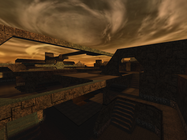
Ok if you remember, O commented on your map last time... and tore it apart....
Lets start with the complements, first off the map has a good layout and I like the overall idea. Also, it realy adds to the flow when you removed all of the clip. A few suggestion to improve for your next release:
The texturing is horrible, the textures do not flow with each other. Pick a texture theme and retexture the map...
Next is the detail of your map your map has a good flow and rhythm in the game play but it is like a quake or early cube 1 map in that it's detail is lacking; this will not work in the new cube maps. The point being you must improve the details in your map, pick some kind of theme, write about this place you have created. Think about what it is, were is it, when is it... Write some back story on the map then once this is done and with this new theme in your map re-approach your map in this new light. This will help improve your architecture and your texturing.
The particle effect you use are pretty sweet, but you should remove the clip on the map so u can go under the pipes. This would make a great hiding spot, or if you really want to get rid of it then you should make a pipe or something that would make sense because it looks as if you can go under there but you are not letting them in... ( That is one big run on sentence ) Also I noticed that you added some unreachable space on one side of the map, do this on all sides of the map and this will improve the "STORY" of your map or theme.
As for the stair design, look at a new design.
Edited by Windecker, Tried to make it a bit more understandable.
Never again.
