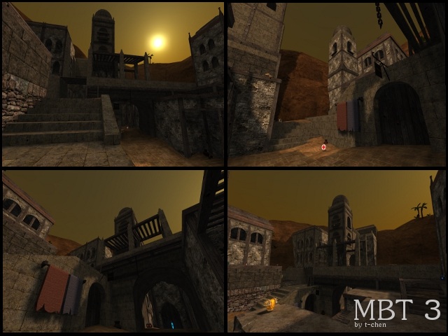
about the map:
i see you added more then only 1 light, i dont think its that bad if only 1 light entinity used, as long as it give enough light and creates a balanced atmosphere. in this case, i think it does because i dont see much more places to add any lights that are a bit logical placed, without decreasing the atmosphere (like burning candles on the middle of the day: :S k...). further theres a uncalced wooden plank just above riflerounds and rockets, near the greenarmour.
texturing, looks like its still unfinished. some wooden planks on buildings arent logical textured (opposite patched) same thing on platforms either. just check the map again for texture mistakes.
clipping/noclipping seems to be unfinished either. much more parts against wall can be noclipped, just to increase that little bit of the flow. further, why did you add that bar of clip inside that piece of "mud" on the platform, under the healthboost, near bullets, rockets and shells?
flow, still can be increased.
gameplay, not sure about that. but theres maybe a much health on the map (7). even tough this can be a matter of taste...
theme, obvious not original.
further, why is this map called "mbt3" (what does that "mbt" has to mean)? is there any sense behind?
anyways, nice map! still needs some work tough, ill give it 7/10...
