mhelenurm | 2010-02-24 19:59
Night Gallery
The screenshot for this content is either missing, improperly captured, has incorrect dimensions, or poorly depicts the content.
Screenshots let people get a feel for your work, and is the most important part of a node. They should be the correct size, and have no heads up display elements. Refer to the User's Guide for information on how to fix this.
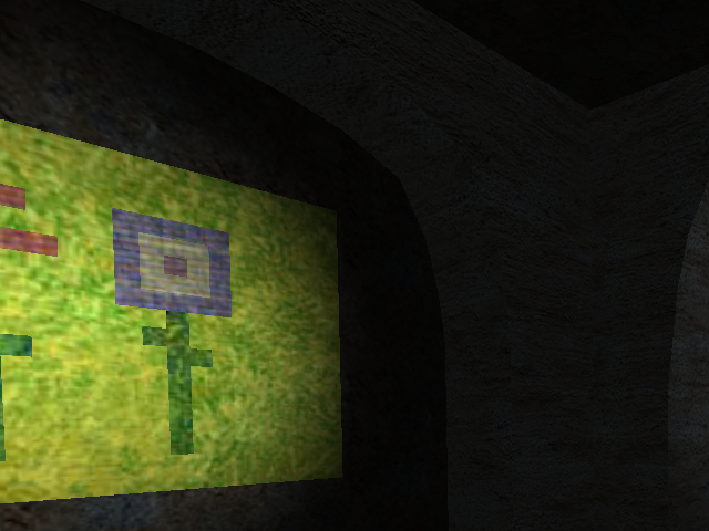
An art gallery at night, made by Spiralz and M@RK
An art gallery at night. A map made by Spiralz and M@RK.
Basically all art (except two paintings) were done by Spiralz, all except 2 statues were done by Spiralz.
Spiralz also made the gallery building.
All lighting was done by M@RK.
*******************************************************
Our first map to be posted on sauerbraten.
Please do not rate until you've actually played on it. ;)
If you have any errors or suggestions, please comment.
One last thing: NO ANGRY COMMENTS, EXPLAIN WHY YOU DON'T LIKE THIS MAP! (lol)
ng01.zip (1.87 MB)
login to post comments
