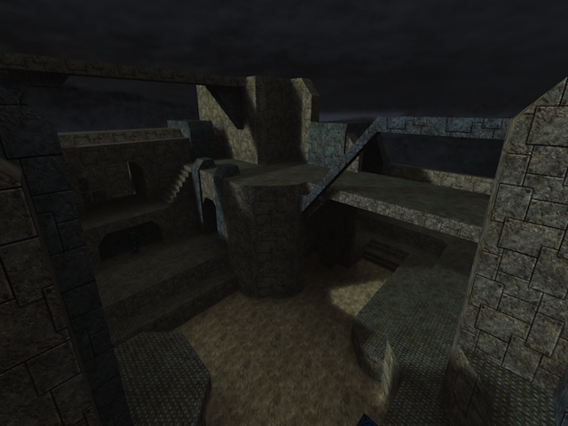
This map has some potential, but looks to have a long way to go as of yet.
To start off, you beveled some corners and not others, on the highest point on the map, the base it is on, one side is beveled and the other side is a sharp 90 degree angle. There are other areas like this, find them and fix them.
Ugly outside edges: Primarily by those turnaround stairs, there is a wall blocking you from falling out of the world. It is just plain on the edge. Try adding trim, or beveling the edges, or angle the whole thing.
The large bevel on the "roof" segment on the highest point of the map, it comes down to form a sharp edge with zero thickness. Add a thin layer below it to give it some shape, it will also prevent jumping players from getting hung up on it.
Trim: You added some ( not to appealing ) trim to some parts of the map but not others! I personally think a 'Thin' line of trim should go around each platform and level to help break up the hard texture differences. It very much impacts the visual appeal.
Your lighting... SUCKS. Its too bland, there is no contrast, and it is way to cold. Even if you want it cold, you can still get some contrast and vibrance, but thus far there is none. One light is not enough.
Texturing: ... also lacks greatly. I count seven used textures. You may be going for a consistent look, but covering all the walls in the exact same texture is not the only way! Break up the constant walls, add minor differences: be it pillars like you did, or horizontal bands running the length, or perhaps a depression in the surface with a different texture inside it.
All in all, finish the geometry, finish the texturing, and by all means work on the lighting!
Edit: Tho you said it was for instagib, ADD SOME WEAPONS! This map is striking me as horribly incomplete.
