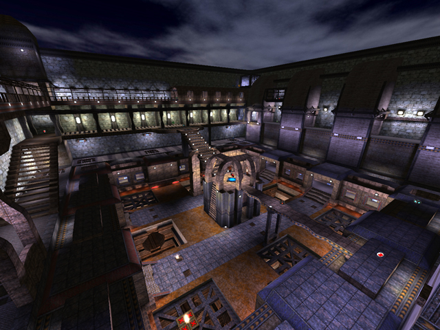
Not bad.. I'm not really a fan of these arena-style maps but this was executed fairly well.
The layout isn't that good, I feel. Symmetrical maps are never a good idea in DM, or at least not semi-symmetrical ones. The paths are fairly limited. There's really only one way to the quad, for instance. And for all that effort, the quad doesn't seem worth it.
The underground doesn't make sense. The lights should be uniform. On that topic, there shouldn't be vivid lights in there at all.
I really like the lighting you did in the map in general though. They're all tweaked to properly cover the area, and in proper color, without oversaturating or washing the areas out.
The texturing is okay. Not the best, no complaints.
As said, the layout is my main concern. Unfortunately that's one of those things you can't really fix; you can merely learn from and start on a new map. For the next map then, I suggest: multiple levels with multiple paths (you covered one of those in this map). If the map is designed to be open, do put a few cover items here and there (a rock, a crate.. anything to hide behind) because a truly open map is no fun at all. This map isn't completely open, but hiding areas are rather limited.
And try to stray from making an arena-style map. Pick a theme for the map and build things freely around that. That is, if you wish. Those maps, I feel, are the most genuine and fun to play on, but arena-style might be your preference. And it's a lot easier.
4/10 - Love the lighting.
