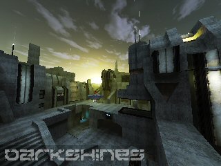
This reminds me of core_transfer - probably the textures you used, especially the concrete one, but also some forms of the architecture. My work-in-progress map looks very similar to this map in some parts.. -sigh-
It's interesting to see an experimentation in this theme though. It's like a clean sci-fi map, very like Halo.
Unfortunately I feel experimentation is at best what you achieved here. The textures aren't really done properly - the white concrete is overused, and I'm not a personal fan of the rusted concrete texture either, because of the lines in it.. It doesn't have the same uniform texturing quality the white concrete one does. The philipk textures are also used somewhat awkwardly. The pkwall textures, for example, need a lot of supporting textures around them to make them work. Right now, combining them with basically just the white concrete one looks strange.
There are just various parts that aren't uniform with the rest of the map. This all comes together as an undisciplined, unrefined orgy of ideas. So many things try to stand out on their own, as though the whole map should complement them, but there are so many competing things to look at that they just make the theme chaotic. For example, the particle 'cannon' thing at the top of the map - what is that for? There is nothing in the map, such as cables or connecting architecture, to imply its purpose. And there are no other areas with tubes of yellow particles, so it's a totally random detail.
The jumppads and lights are a good example. I count at least 3 different kinds of jumppads, some with no indication of their significance as jumppads. I usually advocate uniformity in the jumppads, or at least a uniform characteristic. The lights are another example - nowhere are the same lights, or construction of lights, used. I know it's fun to build ideas, but there does need to be some uniform idea circulating about the map.
The clipping worries me as well. Are people really intended to get to the top of the map so easily? On a DM map I can see that bringing about a LOT of camping. I know I know - core_transfer has the same issue - but I like to think the parts accessible there are a bit easier to get shot at.
Anyways, I'm very compelled to see this develop as a map, and also as a theme. I encourage you to develop it, but I think here less is more. Cut back a few details and make the most important ones the most prevalent ones.
I won't comment on the lights - other people have.
5/10 for now - good start, very useful for what I'm building, but very chaotic.
