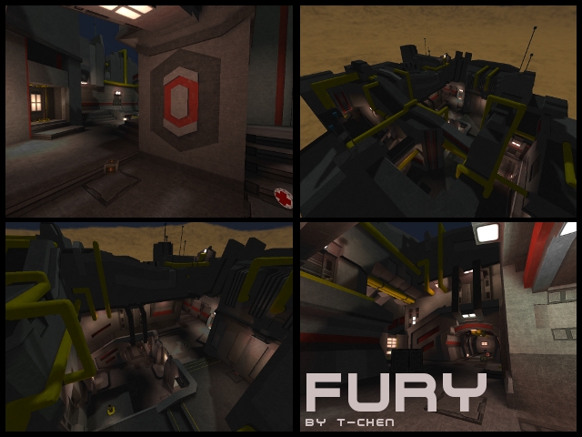
ok ... i would have to say that it is a good map... the textures ... o the texture.... the textures in esence are good good use of color and variety ... but it looks like ive stepped into legoland or cartoon city... there is a complete lack of realism to the texures ... they are plain and flat... for example the red... its a pure.... or prety damn close to pure... which is unnatural... in real life... there is a lack of variety in the textures themself.. also... im no normal maping expert... its one of my 2 flaws of fullfilling prefection... but the looks to reflective.. the map seems to reflect every light one it... rather id look at trying to commit to more of a realistic texture set... the textures look like a noob that is just learning how to make textures ... complete cartoony quality ...
It would be nice to be able to have some trick jumps on this map... i ran out of time to check the whole map but ... i dont think there are any .... :(
I was intirely confused about the tele because i could not tell if it was a dest or a port... if your could change the line partical color for us stupid ppl ... i did notice the difference tho ... on the port theres a red circle in the middle and a dest has none... but i would like to no from far away without haveing to memorize it.... >>>> :)
in all the map is prety good... but man those DAM textures...
YOUR HUMBLE MASTER
chasester
