jonlimle | 2010-01-19 02:02
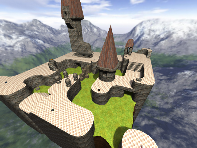
new DM map ***wonderland***
DM map ***wonderland***
New(kinda) DM map called "wonderland" I picked the name because a lot of people said it reminded them of "Alice in Wonderland" this has been sitting on my hard drive for about 7 months, and I know it is kinda basic, but it still has ok gameplay, someone else did help a little but i cant remember there name, anyways leave feedback
wonderland.zip (2.83 MB)
login to post comments
