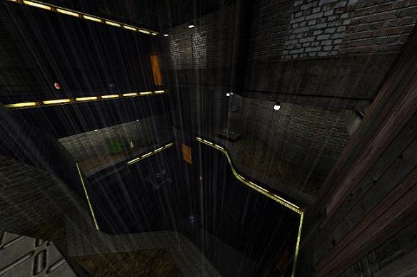
hm for your first map its not that bad..
the layout is a bit too small in my opinion, and you shouldnt spam that much mapmodels, also the pillar is annoying,, i often get stuck there..
you can get stuck on the side of the stairs, noclip or delete.
there are way too much teleports for such a small map (4!)
the playerstarts are placed very unfair.. you either spawn in a corner or at yellow armor
the lighting is on some spots too dark and could have been improved.
white light makes the map looking undone.
also i cant understand why you put these explosion particles at open walls
weapon placement is imbalanced aswell
riflerounds - 1
rockets - 4
bullets - 2
grenades - 2
4 rockets?
too much for a dm map in my honest opinion
the clip on top is bad.. you cant riflejump without jumping against the ceiling > outch
another thing is that new level designer spam mapmodels, not that mapmodels are bad but 43 mapmodels are a bit too much for this small dm.
design: there are no surroundings which would make the world believable or authentic