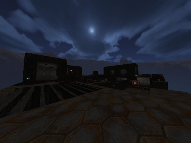
Flow/Gameplay: 7/10
The map flows good, except for the middle, the stairs are not that jumpable when youre fast.
The teleport is nice placed (aard3c principle, jump in tele > other one follows you > kill the one whos now in front of you)
5 of the playerstars are placed on the edge, i dont really think thats such a good idea, rocket > boom > off the map
the middle is a bit open.
the windows could be a bit higher
there is a corridor with only one way in and out, but the windows gives it extra tactic
there are not no or barely jumps/trickjumps (like in reissen) which gives you some advantage or speed, but it got a stable layout.
beside the riflejump between the 2 platforms near the bridge.
Pickup Placement: 4.5/10
The armors are placed in a dead end, nice idea actually but you could have placed something under the window of the green armor
like in nmp9. so you can get back or whatever.
health are enough,
there is only one grenade on your map maybe add one more.
there is a rocket on the platform near the bridge, i would replace one of the riflerounds with this rocket.
Design/Lighting: 2.5/10
The lights are horrible, there are only 14 including the "sky" light with radius 0 (infinity)
the white light makes the map looking undone and boring. the middle area is way too dark.
i would use weak skylight (real skylight: /skylight X) and use more colors then white.
they are all the same RGB value (150 150 150)
there is no variety!
There is no detail, i think some antennas or whatever on the roofs would be nice, and makes the design not that boring.
the mixture of the textures is weird too.
especially the houses (corridors) are monotonously and could have some more architecture then a few curves.
the design is too simple.
the support textures of the stairs are not fitting to the rest of the map
i wouldnt use 4 texturepacks at the same time, (ikbase tech1soc,lunaran,gibbie ) where gibbie were used only for some border tex
the skybox is not really fitting.
there is no texture config.. using the default textureconfig.
There is no "outter" world or other surroundings, the map seems undone and it doesnt feel like its a own world.. its just a space station(?) in the middle of mountains. the world you made seems not reliable or plausible. Maybe take a look on asteroids by blindabuser.
its not his best map but the world he made looks believable
overall:3~4/10. if you fix design issues then max 5
